Senior Product Designer, AgiliCision, Strategy to launch
A B2B governance site for three stakeholders, on one system
AgiliCision is end-to-end decision and meeting governance software for regulated organizations. I designed its site solo, end to end: one structured, trustworthy product story that has to convince three very different stakeholders at once, and the design system that keeps every page of it credible and scalable.
- Role
- Senior Product Designer
- Timeline
- Strategy to launch
- Outcome
- One site, three stakeholder journeys, one design system
Context
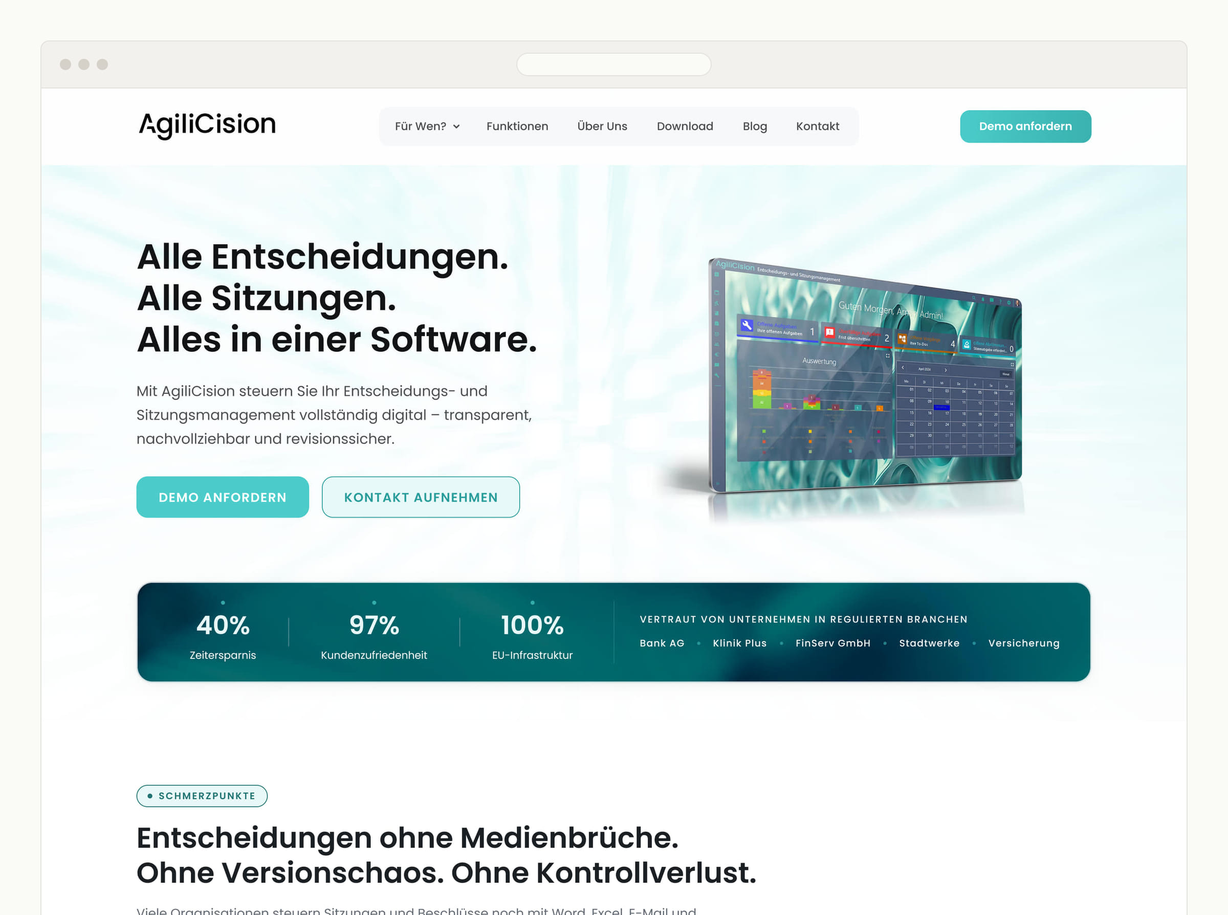
AgiliCision is decision and meeting governance software: a single system that carries a decision from proposal through coordination, voting, documentation, task tracking, and archiving, DSGVO-compliant and hosted in Germany. It sells to organizations that answer to auditors and boards. The website’s job was not to look good. It was to make a complex governance process feel inevitable, and to do it credibly enough that a risk-averse executive forwards it to their legal team.
Problem
The site has to convince three people who want opposite things, in the same scroll. The executive wants security, control, and less liability, and is repelled by anything that looks like marketing. The department or IT lead wants to see the system’s logic, its integrations, its configurability. The assistant who lives in the tool every day wants relief: structure, fewer errors, less manual coordination. One generic pitch loses all three.
On top of that, the category is full of “board portals” and “meeting tools,” so the design had to argue that this is infrastructure, not a feature, without ever raising its voice. The brief was unusually strict about it: structured not playful, trustworthy not trendy, precise not emotional, confident not promotional, systematic not feature-driven. That brief was the real specification. The design problem was translating it, line by line, into something you could click.
Approach
The brief was the design system before the design system
Every positioning principle had to become a visible, defensible decision, not a mood. I treated the brief as a constraint set and made each line accountable to a specific design move, so nothing on the page is there by taste alone.
Positioning, translated into design
Every visual decision traces back to a line in the brief
- Structured, not playful A numbered decision lifecycle and governance language carry the page. No decorative illustration, no mascot, no noise.
- Trustworthy, not trendy Restraint over trend: a calm petrol and slate palette, heavy whitespace, and real regulated-industry proof instead of stock imagery.
- Systematic, not feature-driven Audience journeys lead and features follow. The design system underneath is itself part of the argument that this is infrastructure.
- Confident, not promotional Plain claims, specifics, and structure. No superlatives, no urgency tactics, nothing that reads as a sales page.
- Multi-level by design One site, three tailored entries: executive, assistant, organisation. Each stakeholder meets their own argument, on one system.
One site, three stakeholders
Rather than dilute the message to a lowest common denominator, the site forks into three tailored entries, executive, assistant, organisation, each meeting its stakeholder with their own argument and their own proof, all composed from the same system. A reader never reads someone else’s pitch.
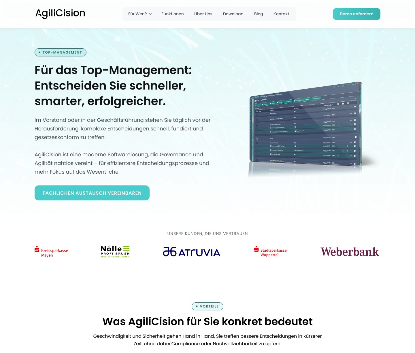
What this stakeholder needs
- Security and control
- Overview at a glance
- Reduced liability risk
- Decision quality
Calm, minimal, high clarity. Nothing to operate, everything to trust.
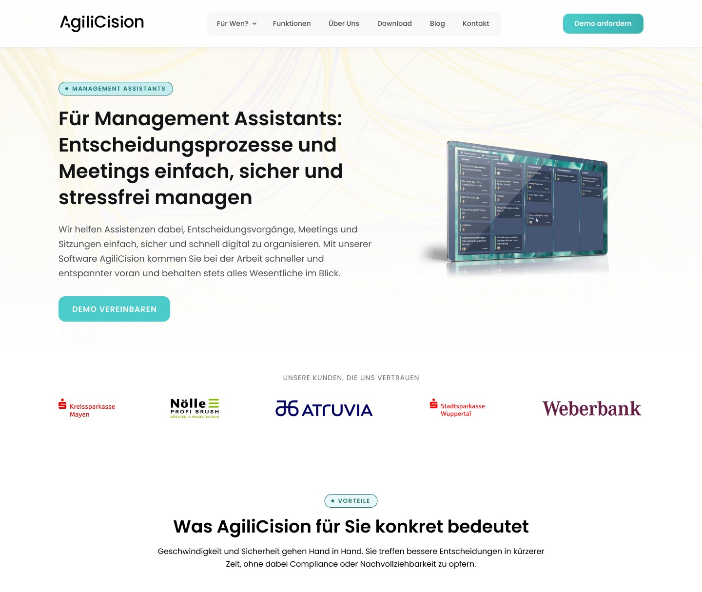
What this stakeholder needs
- Workload reduction
- Structure and clarity
- Fewer coordination errors
- Less manual prep
Clarity and ease. The page reads like relief, not another tool.
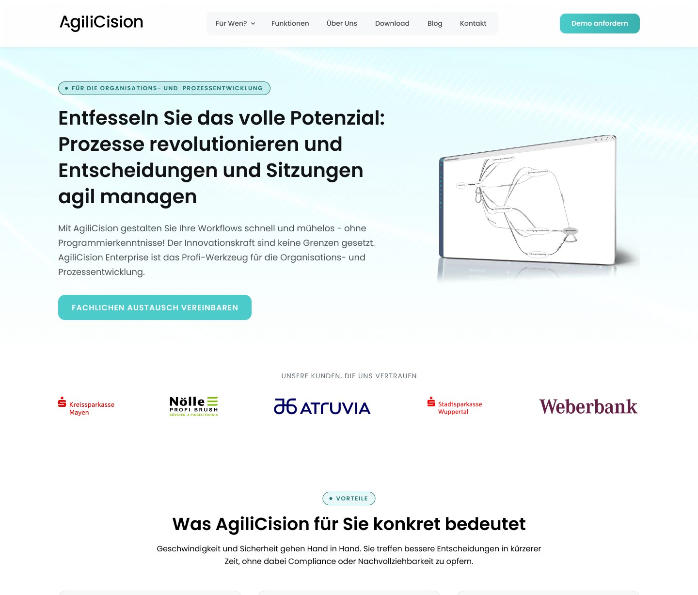
What this stakeholder needs
- Process clarity
- Integration and configurability
- Efficiency at scale
- Visible system logic
System logic is shown, not hidden. Built for the people who run it.
Make the decision legible
The product’s value is an end-to-end governed process, which is also the hardest thing to communicate on a marketing page. So the process itself became the spine of the story: one numbered chain, the same language the product uses, no decorative abstraction. If a visitor remembers one thing, it is that nothing here is informal and nothing is lost.
One decision, end to end
- 01 Antrag Proposal A decision is framed and proposed, with context attached.
- 02 Abstimmung Coordination Stakeholders align and prepare before anyone votes.
- 03 Beschluss Vote Role-based voting, with the rules enforced by the system.
- 04 Dokumentation Documentation The outcome is recorded the moment it happens, audit-ready.
- 05 Aufgaben Tasks Resulting actions become tracked, owned tasks.
- 06 Archivierung Archive Everything is retained and traceable, end to end.
A design system so the trust scales
A product that sells governance cannot have a site that drifts. I built the AgiliCision design system underneath everything: a tokenized color system, a documented type scale, and a component library carrying its full state set. It is not a style kit. It is the reason a nine-page site, in two languages, on WordPress, stays as exact on the last page as the first, and the reason the next page costs hours instead of days.
The site, end to end
The real test of a system is the whole page, not a flattering crop. This is the AgiliCision homepage end to end: the hero, the pain-point chain, the three stakeholder entries, the feature grid, the two editions, the proof, the FAQ, all composed from the same tokens and components. Scroll the full thing. It holds from the first section to the footer, which on a site that sells governance is the entire argument.
Outcome
Delivered solo, end to end: the positioning-to-design strategy, the full multi-level site (home, three stakeholder journeys, product, about, contact, downloads, blog), and the AgiliCision design system v1.0 that holds it together. The brief’s hardest constraints held all the way through: no stock photography, no startup noise, three audiences served without three websites.
- 3
- Tailored stakeholder journeys on one system
- 9
- Pages designed solo, strategy to launch
- 0
- Stock photos, the brief's discipline held
What shipped reads the way the brief asked it to, as infrastructure rather than a campaign, which for software that asks a regulated organization to route its decisions through it is the entire point.
Reflection
The hardest part was restraint with a purpose. The instinct on a B2B site is to add: another illustration, another gradient, a louder claim. Here every one of those would have cost trust, so the work was mostly subtraction, and defending the subtraction. The three-audience structure was the decision I was least sure of and now most certain about: separate journeys felt like more surface to maintain, but one system made that nearly free, and it is the only honest way to speak to an executive and an assistant without patronizing either.
What I would do differently: build the design system one step earlier. I built it in parallel with the first pages, and the first two pages paid a small tax that the remaining seven did not. On a project whose entire argument is “this is a system,” the system should exist before the first page does.