Lead Product Designer, Innovatix, Discovery to launch
A white-label clinic platform, one system across app and dashboard
Innovatix is a clinic appointment platform with two products: a patient mobile app and a clinic operations dashboard. I led design on both and the system underneath them, built so a new clinic gets its own branded product by reconfiguring content and theme, not by rebuilding. The system is what makes white-label viable, and what keeps a four-step booking flow and a hospital-grade operations console reading as one product.
- Role
- Lead Product Designer
- Timeline
- Discovery to launch
- Outcome
- Re-skins to a new clinic in days, not a rebuild
One platform, two products
Context
Innovatix is a clinic-focused appointment platform that simplifies a genuinely messy problem: getting a patient and a provider to agree on a time, and running everything that happens around it. It is two products, not one. Patients get a mobile app to find care and book it. Clinics get a web dashboard to run appointments, records, billing, and supply. It was built as a white-label product, so each clinic client ships its own branded instance on shared fundamentals, the content and the brand change per client, the system does not.
Problem
Clinic scheduling looks simple and is not. Many providers, many departments, reschedules, cancellations, no-shows, partial payments, supply that runs out. The two people using the product want opposite things: the patient wants to book in under a minute and never think about it again; the front desk wants every one of those moving parts legible at a glance. Designing for one of them well is normal. Designing for both, in one coherent product, is the job.
The white-label constraint raised the bar past “design a clinic app.” It cannot be a bespoke design tuned to one clinic, because the next clinic gets the same product with different branding, specialties, and content. So the real problem was never a screen. It was a system that yields many clinics’ products without drifting, where a new client is a reconfiguration and a re-theme, not a redesign. Get that wrong and every new client is a rebuild, and the business does not work. Get it right and the design is the product.
Approach
Two registers, one system
The patient app and the clinic dashboard are deliberately not the same texture. The app is warm and consumer-grade: a bright blue, generous spacing, photography, large tap targets, one clear action per screen. The dashboard is calm and operational: denser, quieter, built for scanning hundreds of rows without fatigue. They look different on purpose, because the patient and the front desk are doing opposite work. What keeps them one product is underneath: the same tokens, the same type system, the same components, themed two ways.
The booking flow is the spine
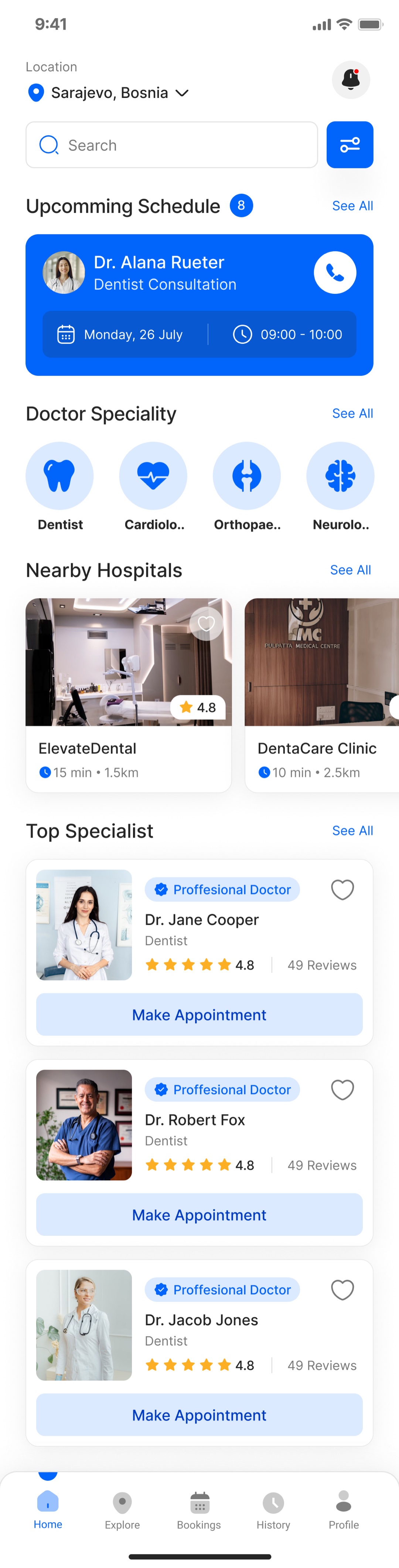
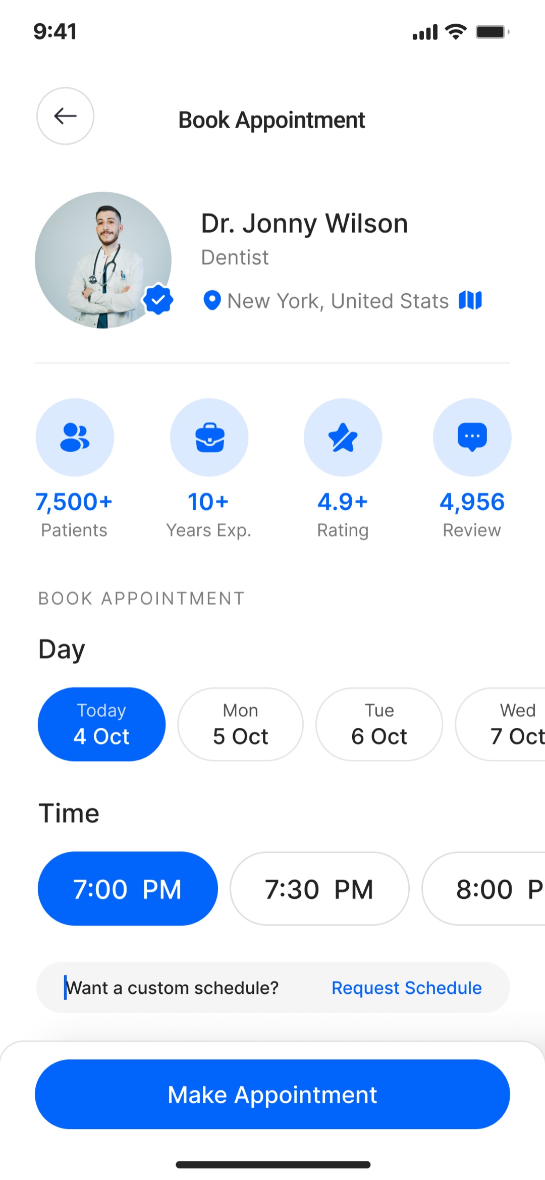
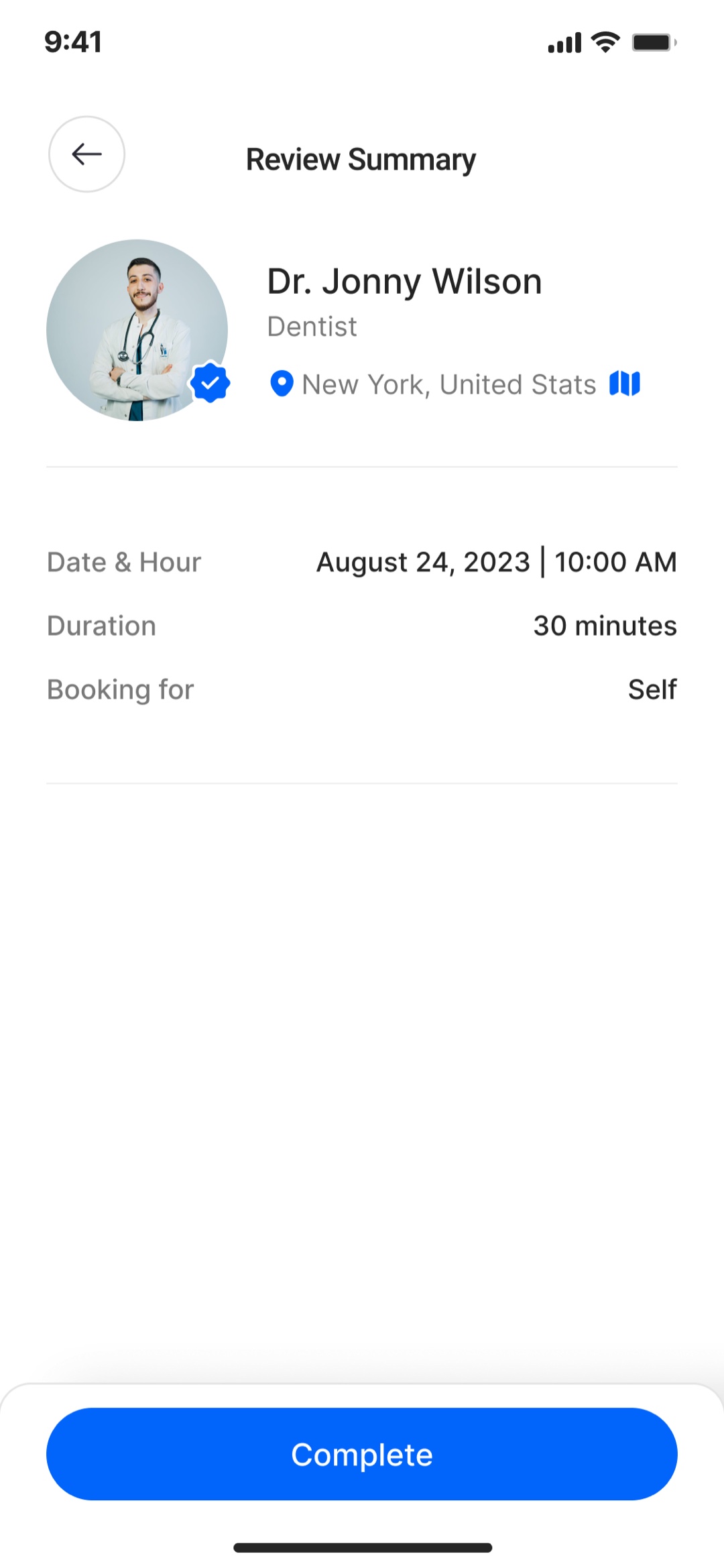
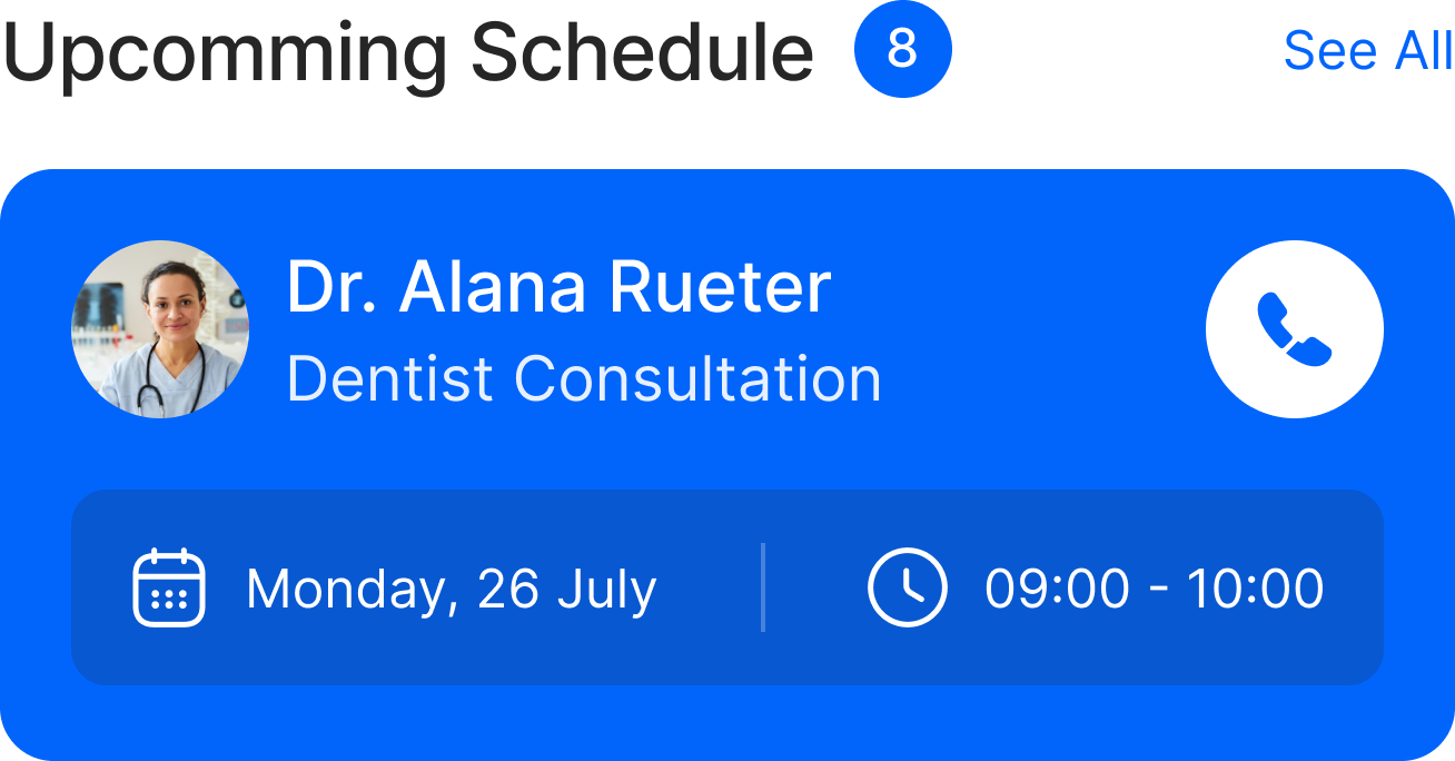
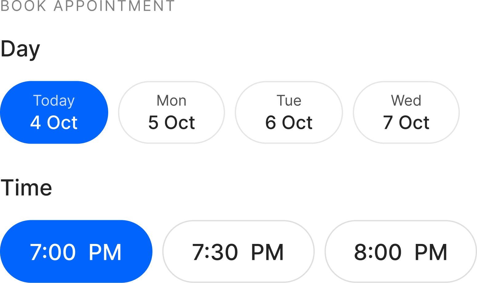
Everything in the patient app serves one path, so I designed that path to lose as few people as possible. Discover a provider by specialty, map, or search, with filters down to instant-book. Trust them, the profile leads with the stats and verified, photo-filtered reviews that decide whether a stranger will let this person treat them. Book in a single screen of days and time slots, with a request-a-custom-time escape hatch so a near-miss never becomes an abandon. Review once. Done.
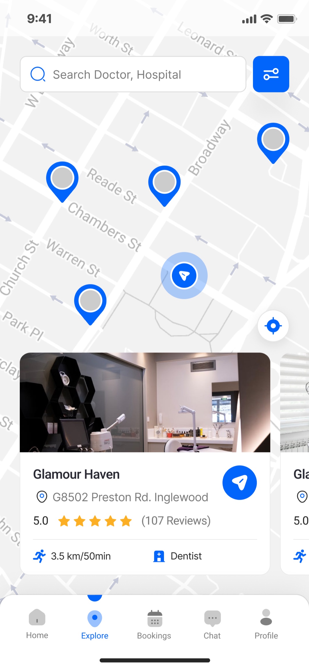
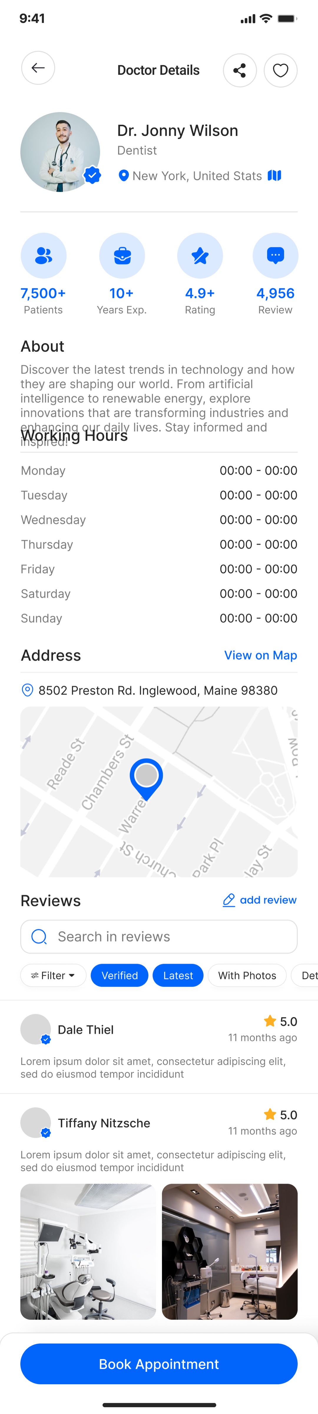
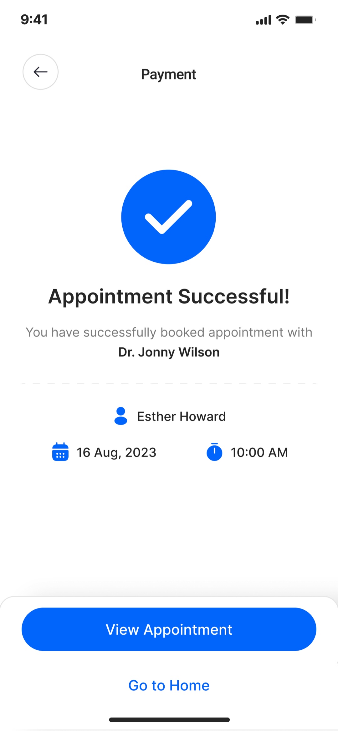
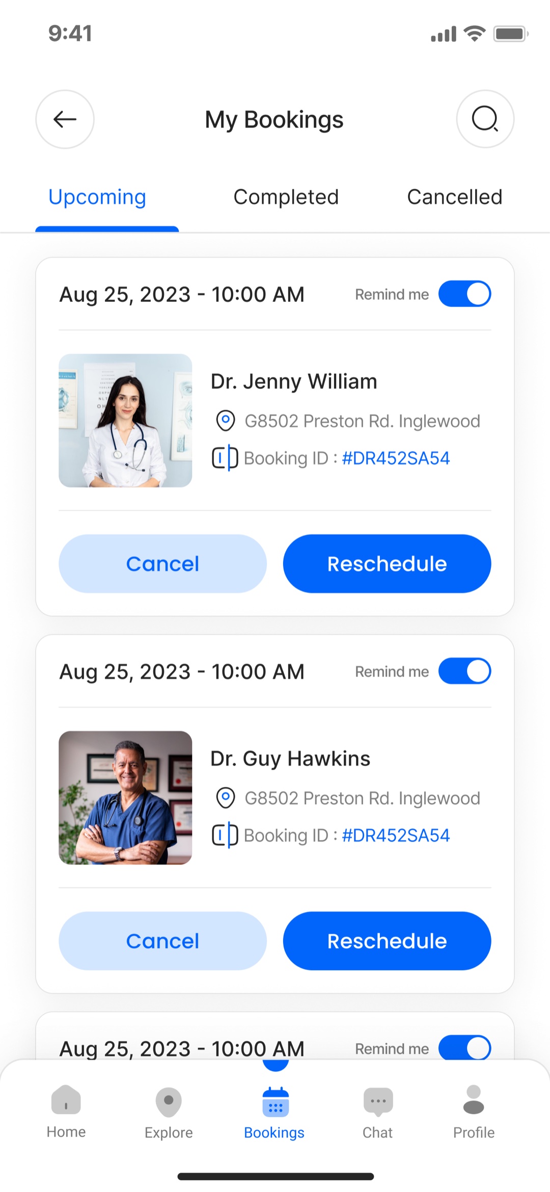
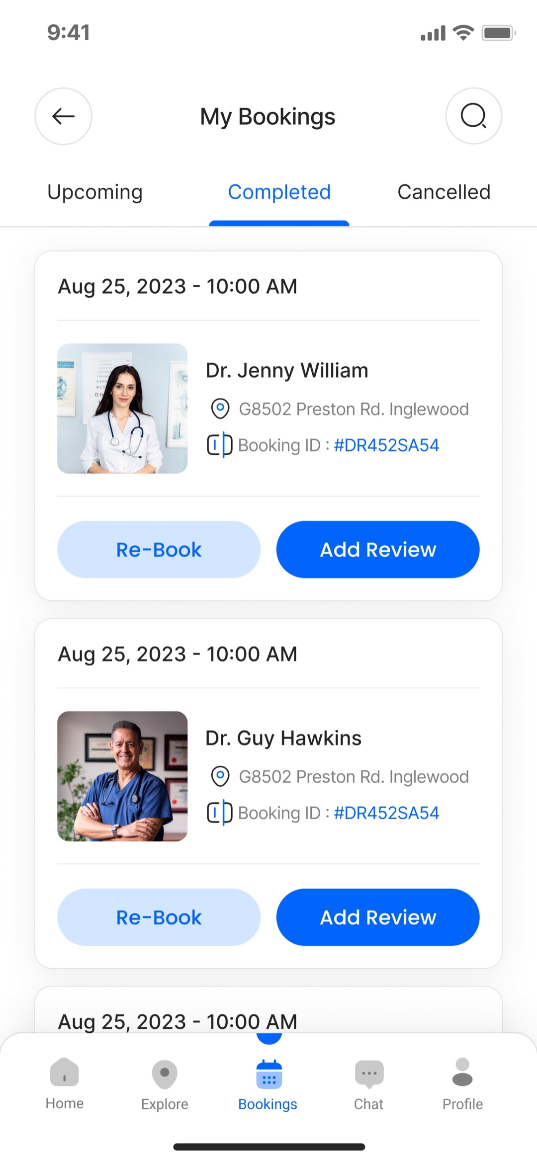
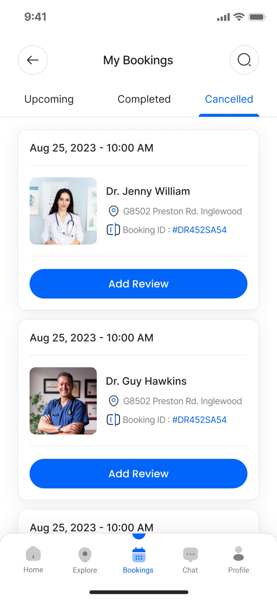
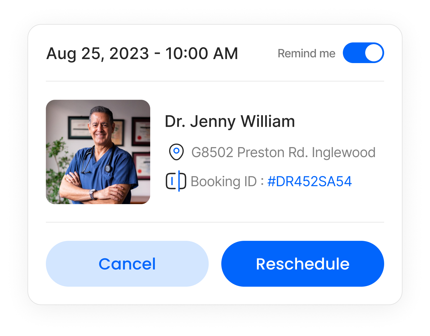
A booking is not finished when it is made. The app carries the whole lifecycle, and the actions follow the state: an upcoming booking can be rescheduled or cancelled, a completed one can be re-booked or reviewed, and a cancelled one stays on the record instead of vanishing. The unglamorous half of a booking product is where trust is actually kept, so it got the same care as the flow that gets people in.
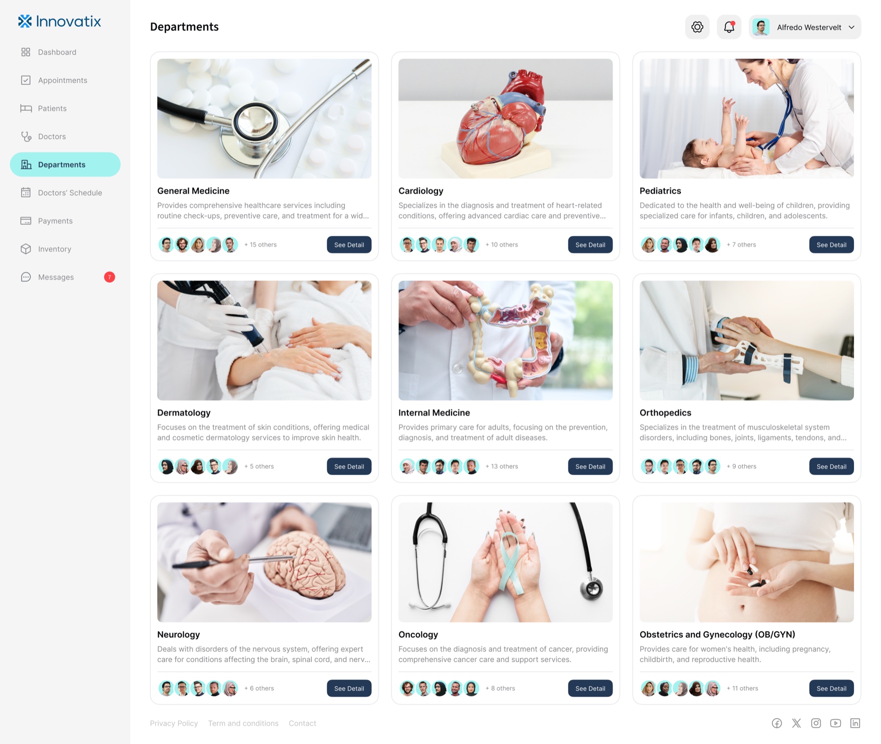
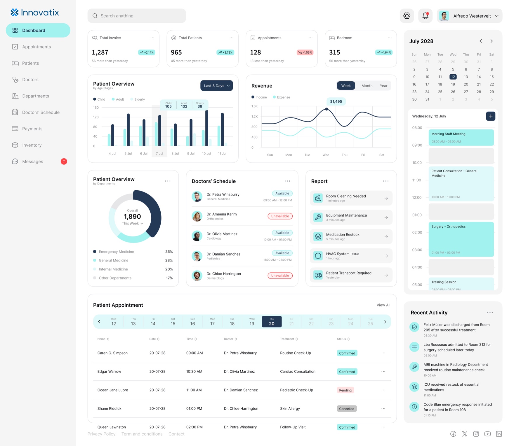
Make the clinic legible at a glance
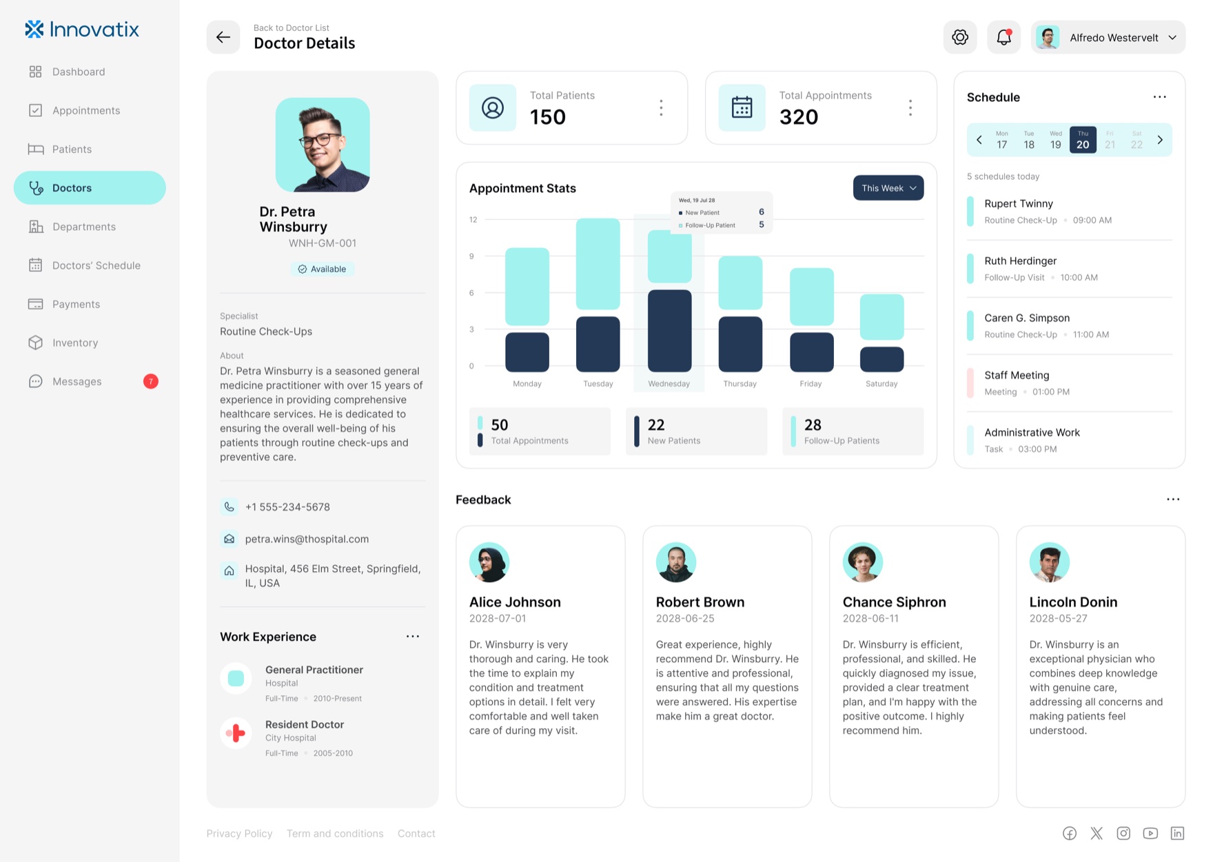
The dashboard is a hospital’s operating picture, and its job is to be readable under density. I built one status language and used it everywhere: confirmed, pending, cancelled for appointments; available and unavailable for doctors; active, new, and inactive for patients; in stock, low, and out of stock for supply. Same shapes, same colors, same meaning on every screen, so a glance is enough and the staff never relearn the product moving from billing to inventory to the day’s schedule.
Depth was the point, not breadth for its own sake. The patient record is the clearest test: contact and insurance, a clinical vitals grid, allergies, conditions and medications, a notes timeline, attached health reports, and the patient’s own appointment history, on one screen, without it feeling like a database dump.
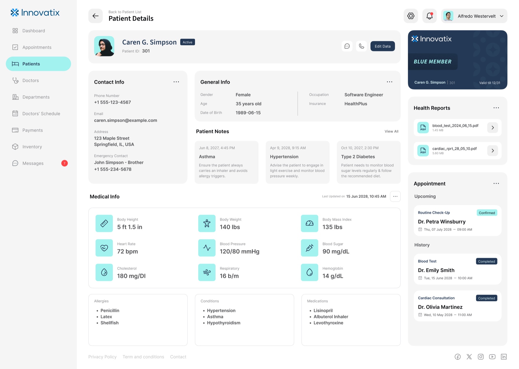
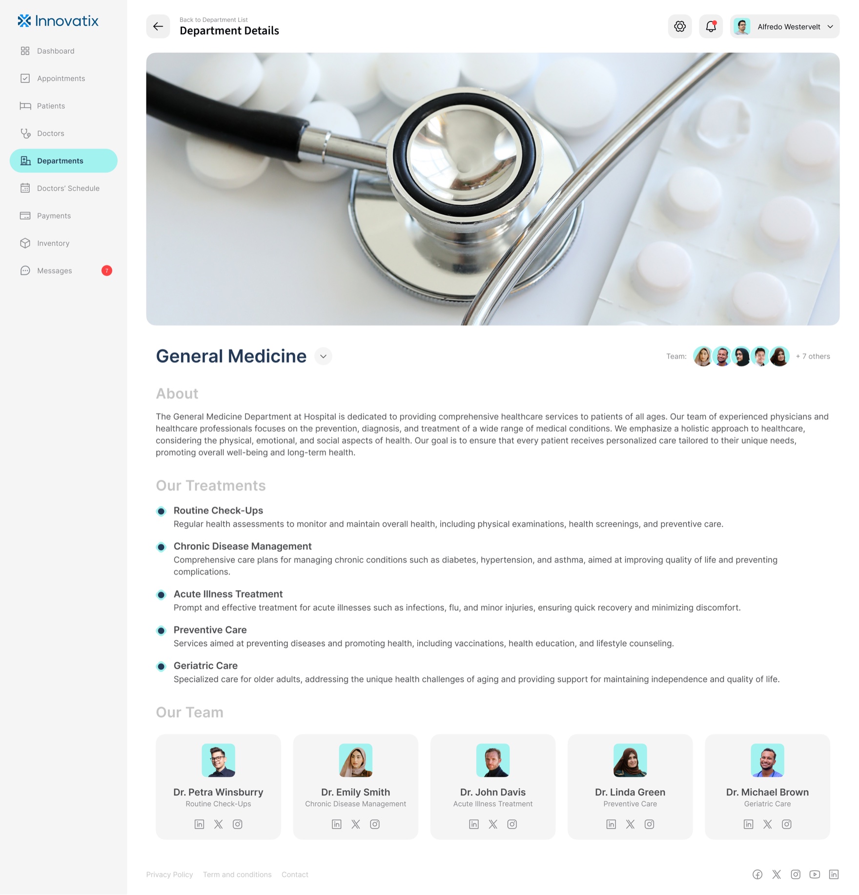
That same structure runs the rest of the operation: the appointments queue, the patient and doctor rosters, the clinic-wide calendar, payments with overdue states, the supply chain, and a messaging hub that puts staff, doctors, and patients in one thread. Thirteen dashboard screens, one grammar.
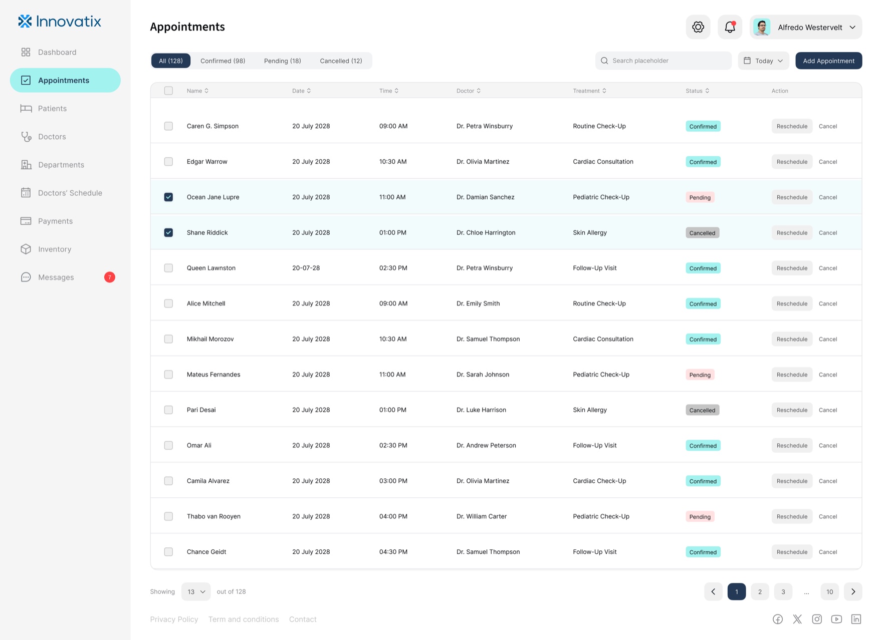
All / Confirmed / Pending / Cancelled, with row actions and bulk select.
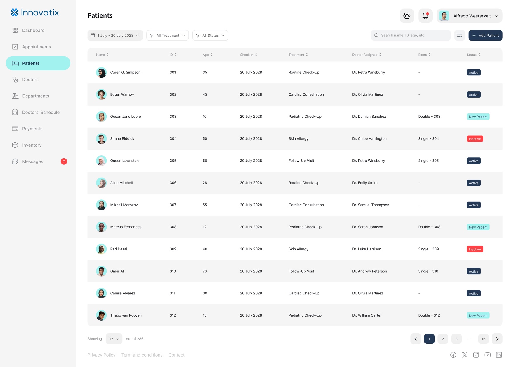
286 patients, filtered by date range, treatment, and status.
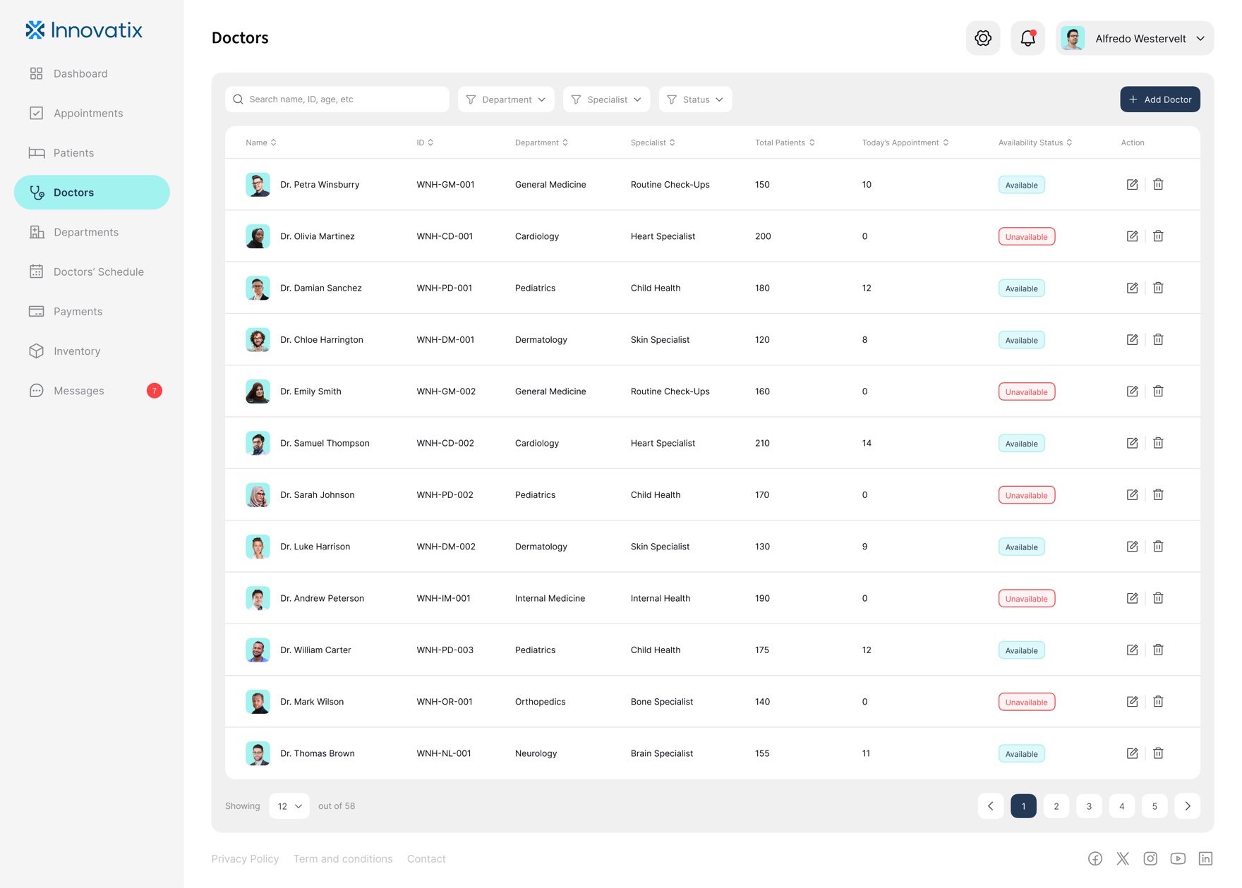
Roster with live availability and per-doctor load.
Performance, schedule, and feedback in one record.
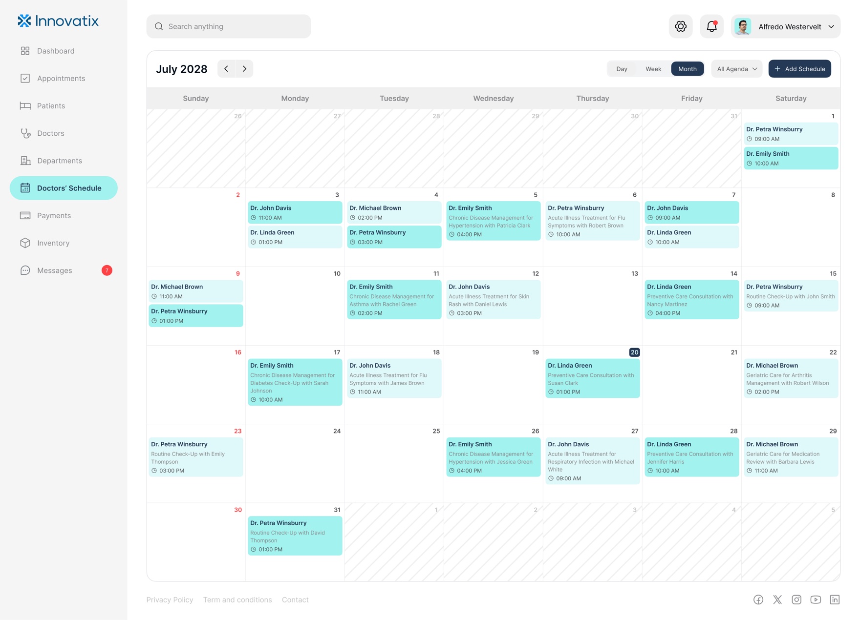
The whole clinic's calendar, day to month.
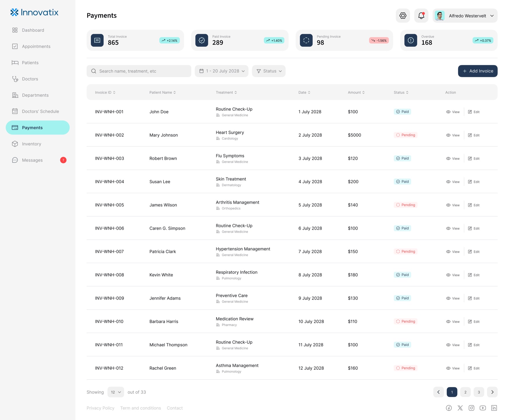
Invoices with paid, pending, and overdue states.
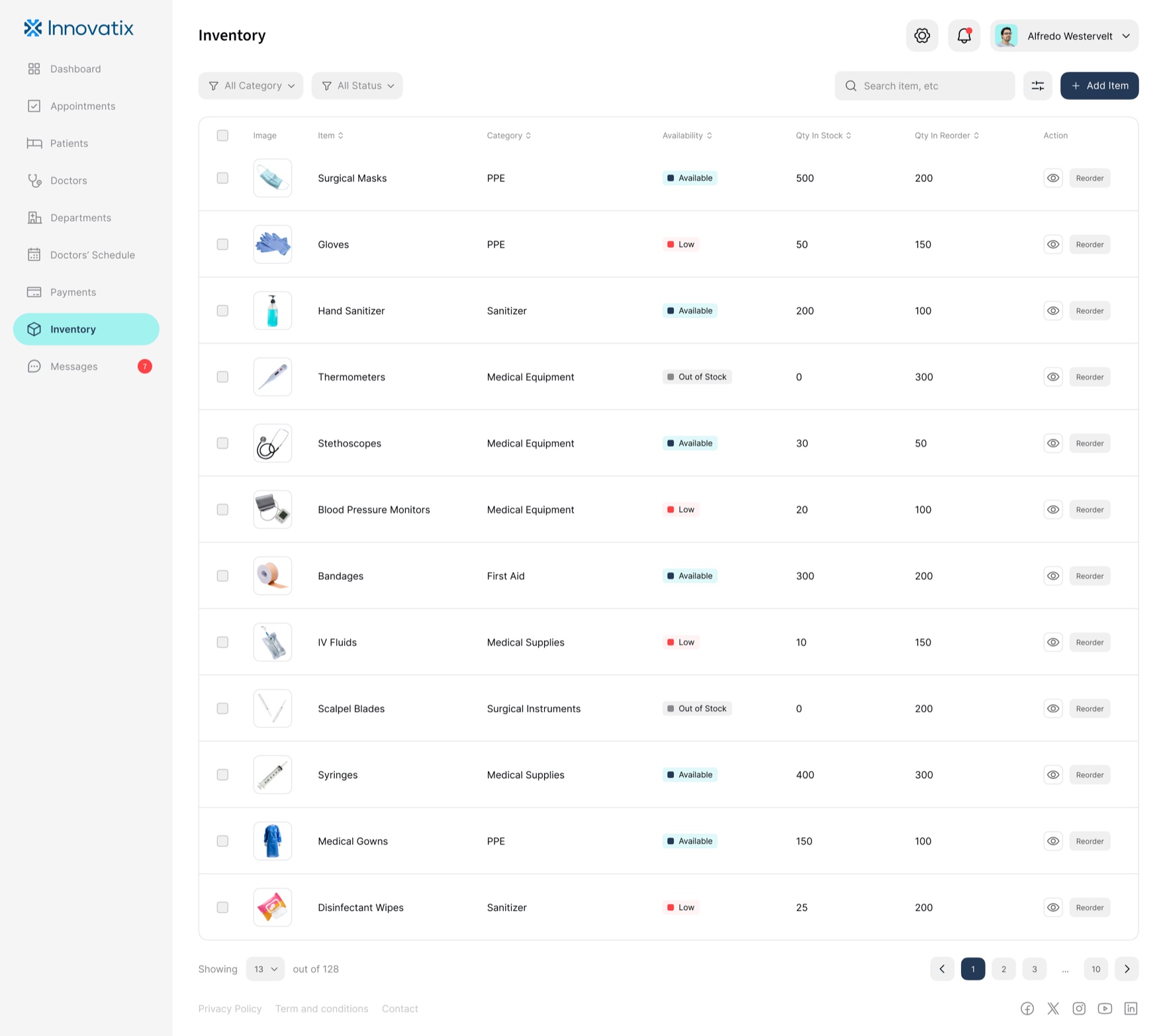
Supply chain: in stock, low, out of stock, reorder.
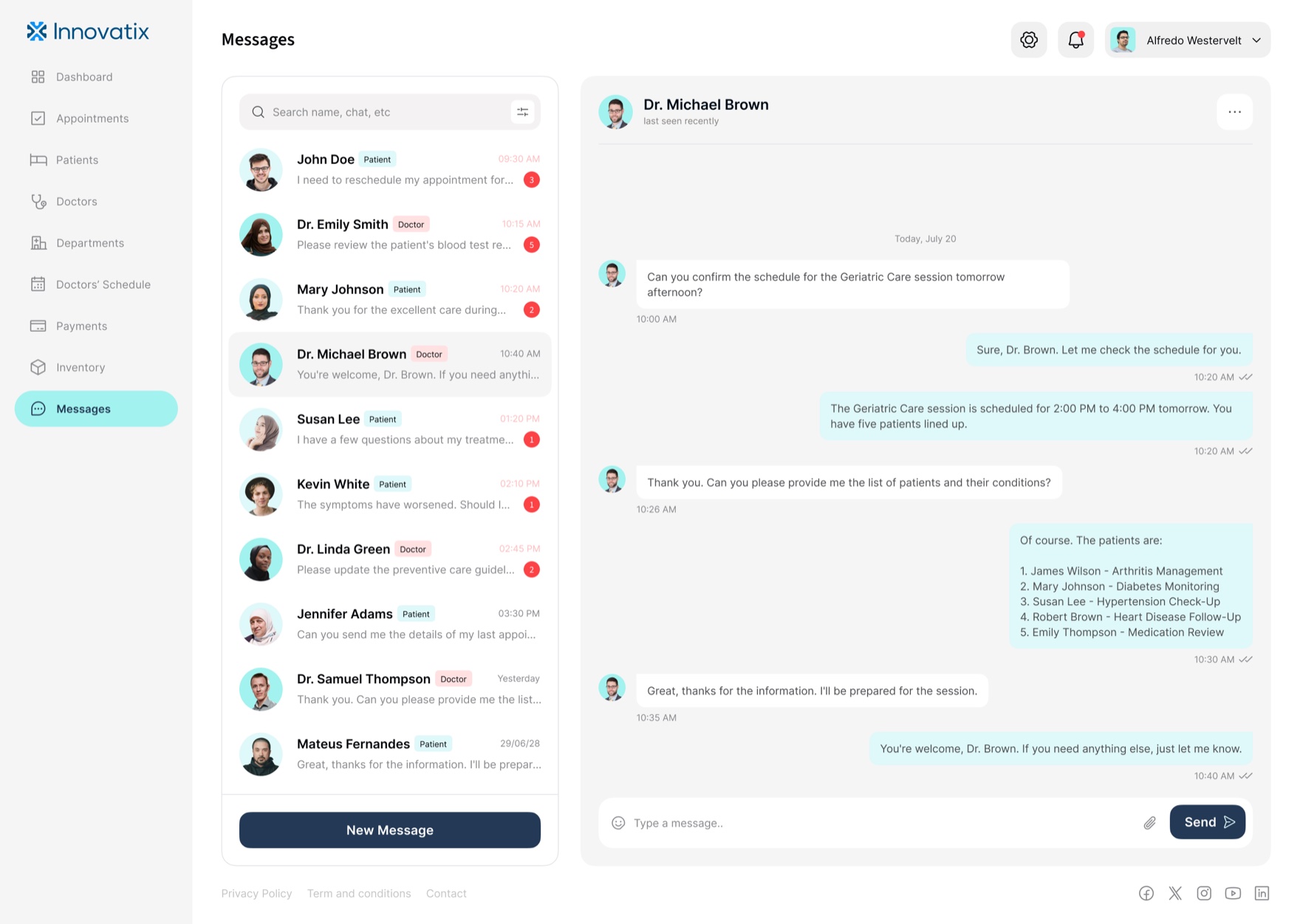
One thread for staff, doctors, and patients.
The dashboard also flexes between data and editorial where the content asks for it. The department views carry photography and prose, because a clinic introducing its specialties is doing marketing, not data entry, and the system has to be good at both without two design languages.
A tokenized system so white-label is reconfiguration, not redesign
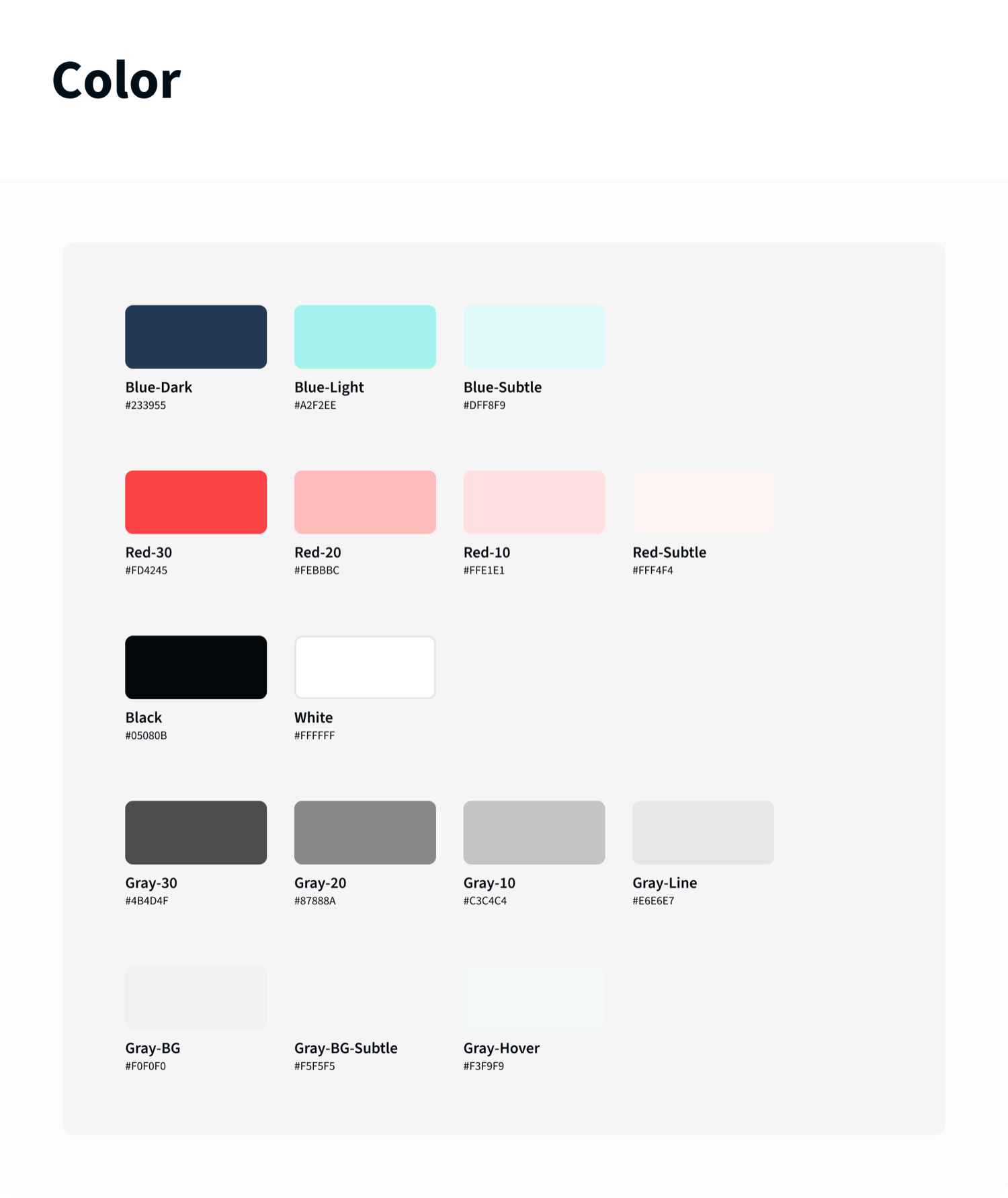
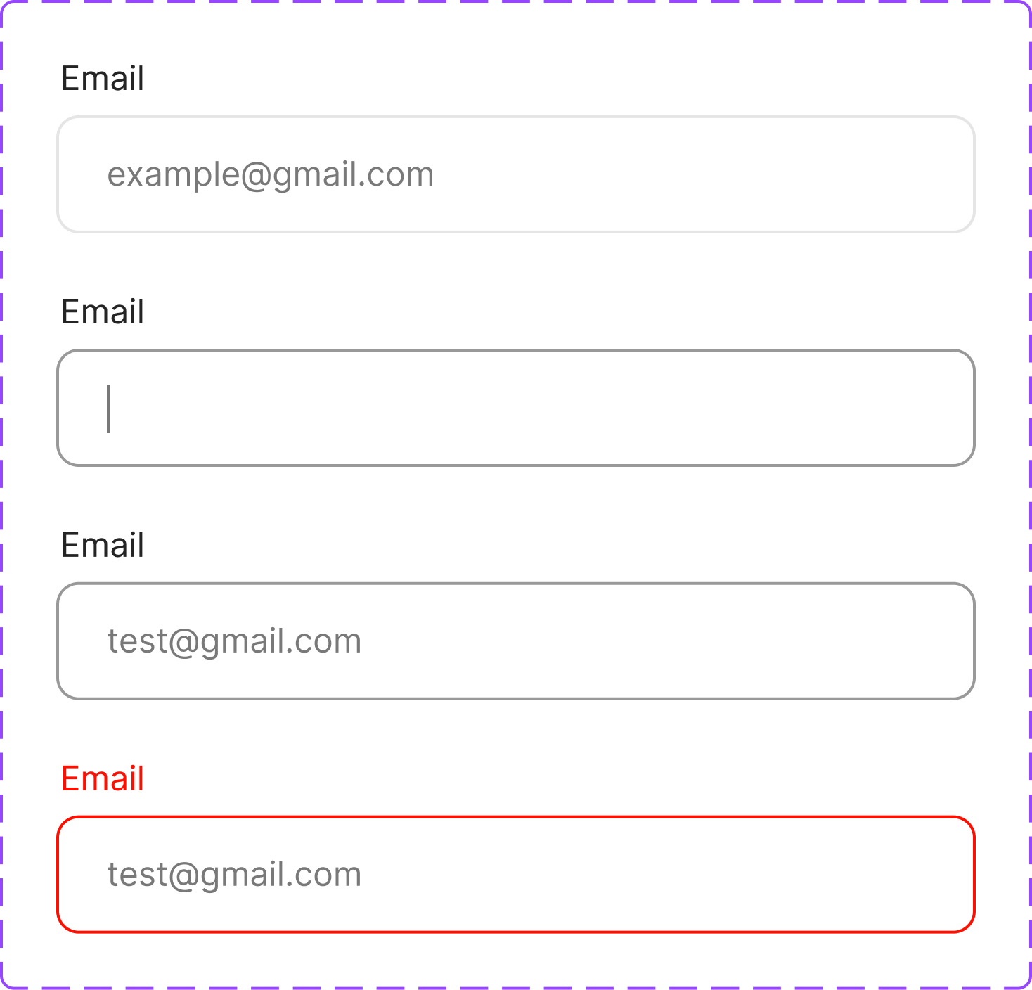
This is the decision the whole business model rests on. The system is tokens first. Color is a named, tiered scale, not a pile of one-off hexes: a brand family (Blue-Dark #233955, Blue-Light #A2F2EE, Blue-Subtle #DFF8F9), a status-red family at the same 30 / 20 / 10 / Subtle tiers, and a neutral ramp from line to background. A full type ramp sits on top of it, and a component library carries every state, including the loading, empty, and error states an operational product lives in.
Because the product references tokens and components instead of fixed values, a new white-label client is a configuration, not a project. Re-point the brand tokens, swap the content and specialties, and the same booking flow and the same operations console come out wearing the new clinic’s identity, with the fundamentals and the accessibility decisions already made. That is what lets the platform onboard a client in days instead of rebuilding for months.
One mobile system, themed per client
Components with their full state set, exported from the library


Built to be built
A white-label system that only exists in Figma is a liability, because every client deployment would re-interpret it. So the components were drawn for handoff: every interactive element specified with its states, the status language defined once as tokens engineering could implement directly, and the two products held to the same library in code, not just in the file. I worked with the engineers through implementation so the system stayed intact under build pressure, which is the only place a white-label promise is actually kept or broken.
Outcome
Two complete products shipped on one system: a patient app of roughly fifty-five screens and a thirteen-screen clinic dashboard, with zero one-off screens across either. Patients reach a booked appointment in four steps and under a minute. The first cohort of pilot clinics went live on the platform, and front-desk scheduling overhead dropped by about thirty percent against the manual process it replaced. The decision that mattered most paid off where it had to: a new white-label client now goes from a months-long rebuild to an under-two-week themed reconfiguration. White-label was not a slide. The system made it true.
Reflection
The hardest design work here was not the patient app. It was resisting the urge to perfect one clinic’s experience when the product had to be every clinic’s. Every screen had to survive being re-skinned, which meant the right move was often the more systemic one, not the more beautiful one, and holding that line was the job.
What surprised me: the dashboard, not the app, was where the system earned its keep. Consumer screens forgive a little drift. A dense operational table does not, inconsistency there reads instantly as a bug, so the operational side is what proved the tokens were real. And the tension I kept navigating, the one worth naming: stakeholders judged the work by the single prettiest screen, when the actual deliverable was the system that made the next screen, and the next client, nearly free.