Senior Product Designer, Liberty Rent, 2023 to 2024
One system, two audiences: a risk product made legible
Liberty Rent replaces traditional resident screening with an underwritten risk pool, so property managers reach full occupancy with less risk. I designed its product: one system that makes a complex insurance idea read as plain trust, for two opposite audiences, carried straight from the brand I had built.
- Role
- Senior Product Designer
- Timeline
- 2023 to 2024
- Outcome
- Brand to a build-ready product system, two audiences, one architecture
Context
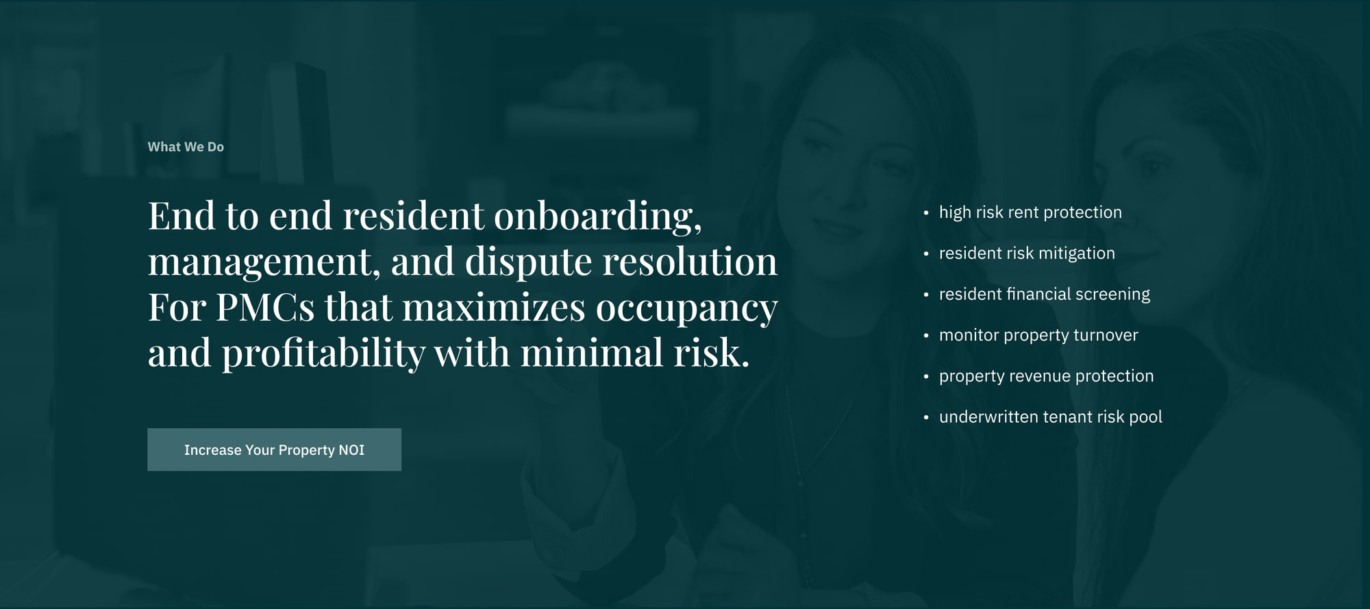
Liberty Rent is end-to-end resident onboarding, management, and dispute resolution for property management companies. Its core move is financial: it replaces traditional resident screening with an underwritten risk pool, so an operator can fill units, expand the applicant pool, and protect revenue without absorbing the risk that usually comes with saying yes. I had built the Liberty Rent brand. The next job was to make it a product: the marketing and conversion site that has to sell that idea.
Problem
The thing being sold is abstract and low-trust by default. “Underwritten risk pool” is machinery, not a benefit, and the category it sits in (screening, tenant risk) is full of fear-based pitches. The site had to make a property manager believe an insurance mechanism would help them, and it had to do that for two audiences who want opposite things: owners and operators protecting a portfolio, and renters trying to get into a home a conventional screen would reject.
The brand already existed and was deliberately calm. What did not exist was the product surface: the architecture, the page system, the proof. Copy and the front-end build sat with the Liberty Rent team, which made the design problem sharper, not softer. The system had to be unambiguous enough to hand off and stay coherent once it was out of my hands.
Approach
Lead with the outcome, not the mechanism
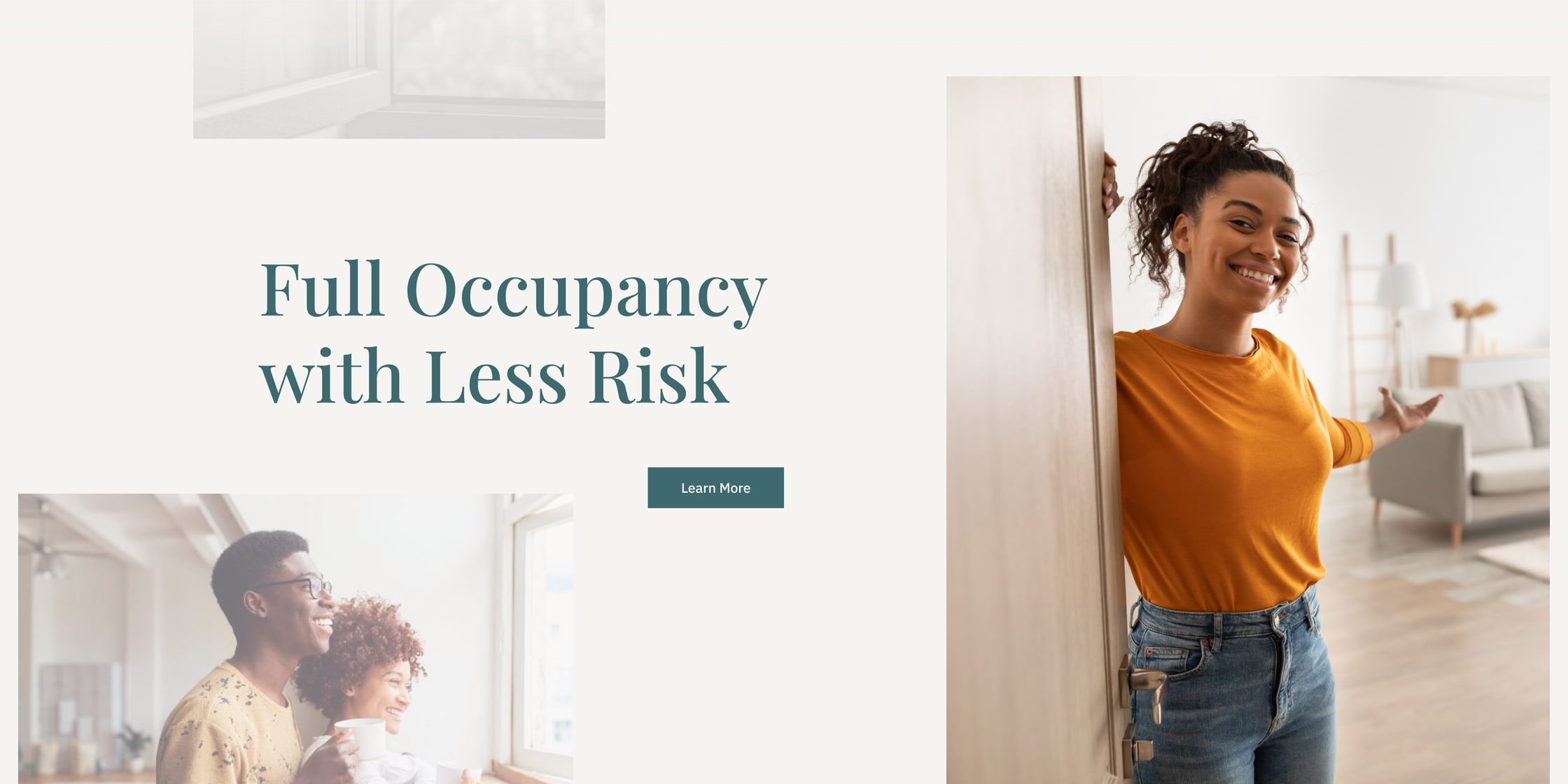
Every surface opens on what the operator wants, not on how Liberty Rent works. The mechanism is real and it matters, but it is never the headline. The home page leads with the result, then states the work plainly: end-to-end onboarding, management, and dispute resolution that maximizes occupancy and protects revenue, with the guarantees listed as outcomes, not features.
The brand, translated into a product
The brand was a position before it was a palette: calm, credible, plain-spoken about a thing people are primed to distrust. I treated that position as the specification and made each product decision accountable to it, so nothing on the site is there by taste alone.
Brand strategy, translated into product
Every product decision traces back to the positioning, not to taste
- Lead with the outcome, not the mechanism Every surface opens on Full Occupancy with Less Risk, the operator's goal, never on underwritten risk pool, the machinery behind it.
- Two audiences, never one diluted pitch The architecture forks for owners and operators and for renters, so neither has to read the other's argument to find their own.
- Proof carried as a system, not a claim A results module, named-operator testimonials, and a filterable insights engine do the convincing the category's jargon cannot.
- The brand ships, it is not reinterpreted Playfair Display, IBM Plex Sans, the glacier-teal palette and the two-triangle mark move from the guidelines into the product unchanged.
- Make the abstract tangible A plain-language privacy notice, an explicit consultation process, and a property NOI calculator turn an insurance idea into something a manager can act on.
One architecture for two audiences
Diluting the message to serve everyone would have lost everyone. Instead the architecture forks: owners and operators get the portfolio and revenue argument, renters get the access argument, and the two never have to read past each other. Both paths converge on a single qualifying funnel, so the site sells and pre-screens in the same motion.
One architecture, two audiences, one funnel
Owners & Operators
Will this fill units and protect revenue without adding risk I cannot see?
Renters
Can I get into the home I want when a traditional screen would turn me away?
Both paths converge on the same qualifying funnel
- 01 An expert makes contact A specialist reaches out only after the operator's requirements are analyzed, so the first conversation is already informed.
- 02 An NDA, if it is needed Portfolio data is sensitive, so the process names the privacy step explicitly rather than burying it.
- 03 A comprehensive proposal Estimates, timelines and the team are put in writing, so the operator decides on specifics, not a sales promise.
Proof as a system, not a claim
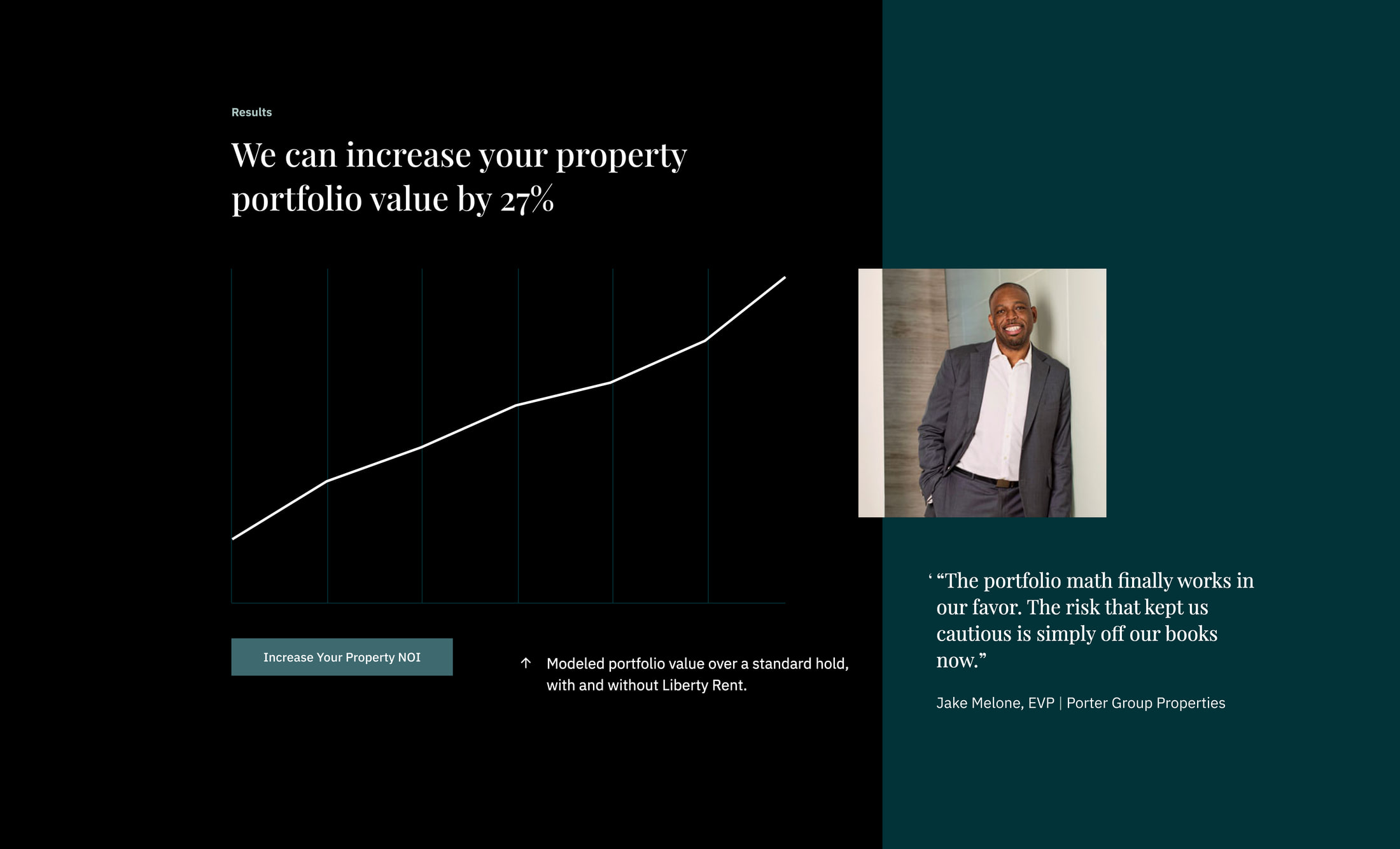
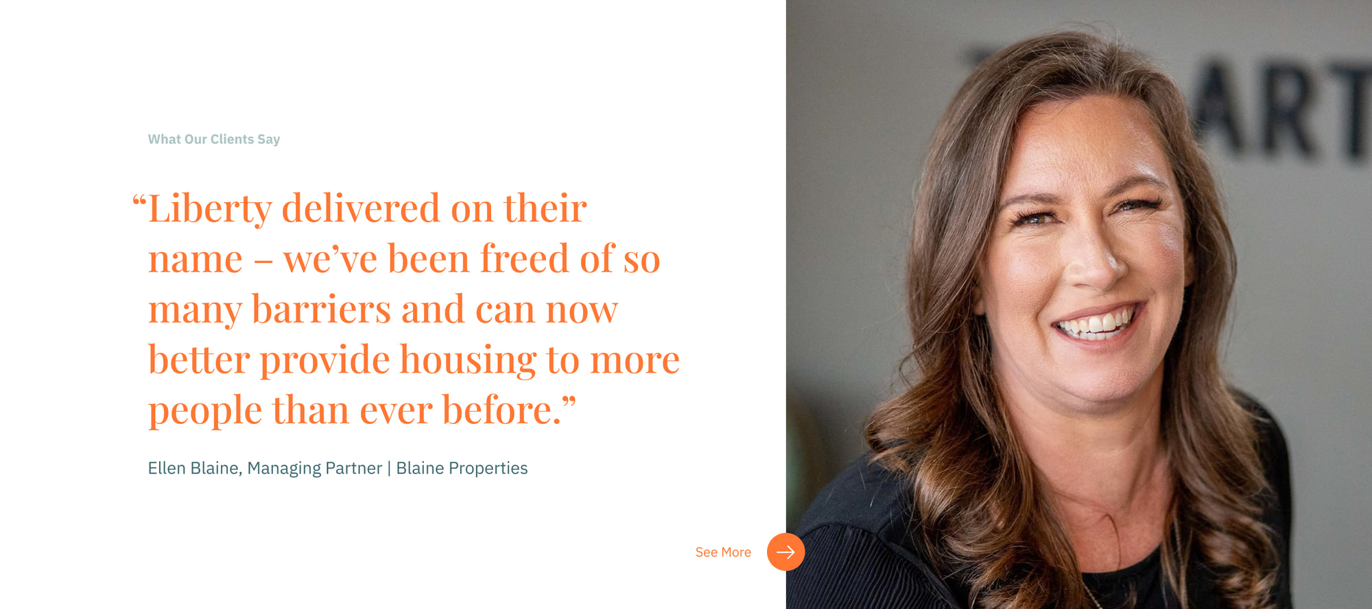
A skeptical buyer does not believe adjectives, so the site argues with structure. A results module puts the core promise in plain numbers. Named operators carry the testimonials, not anonymous quotes. And an Insights engine, filterable by topic and content type with a property NOI calculator beside it, does the slow credibility work the category’s language cannot.
The homepage, end to end
A system only proves itself as a whole page, not a flattering crop. This is the Liberty Rent homepage from the navigation to the footer, every section assembled from the same components and tokens: the outcome-led hero, the PMC guarantee set, the proof, the editorial engine, the consultation funnel. It holds from the first screen to the last, which for a product that asks a skeptical operator to trust an underwriting mechanism is the argument itself.
Outcome
Delivered as a build-ready product system: the positioning-to-interface strategy, the information architecture for two audiences, the full page set, and the design system that carries the Liberty Rent identity into the product unchanged. It was handed to the Liberty Rent team to build, and it was specified to stay coherent once it was.
- +27%
- Projected portfolio value lift, the product's promise made central
- 2
- Opposite audiences, one architecture, no compromise
- 0
- Brand drift from the identity to the shipped product
The identity this product grew from, the mark, type and brand system, lives in the visual archive.
Reflection
The discipline here was resisting the category. Risk and screening sites reach for fear because fear converts, and every section wanted to be louder and more anxious than the last. Keeping Liberty Rent calm only worked because the brand had already decided that calm was the strategy, so restraint was the brief, not my preference. The two-audience fork was the call I was least sure of and now most sure about: it looked like twice the site to maintain, and on one system it was nearly free, and it is the only honest way to talk to an owner protecting capital and a renter who keeps getting turned away. If I did it again I would prototype the consultation funnel against real operator objections before designing the pages around it, because the funnel is where the abstract product finally becomes a decision, and it deserved to be the first thing tested, not the last.
Product design, information architecture and the brand-to-product system: mine, end to end. Copy and front-end build: the Liberty Rent team.