Senior Product Designer, Pickleball.com, Jan 2025 to present
A three-tier design system for a multi-app platform
A three-tier native-first design system for Pickleball.com: tokens-first foundations, a re-themed iOS HIG and Material 3 primitive library, and shared screens that scale to new native apps in weeks. Powers six web sub-products and the platform's native apps from one source of truth.
- Role
- Senior Product Designer
- Timeline
- Jan 2025 to present
- Outcome
- Six web products + native apps on one system
One primitive library, two native languages
- Buttons

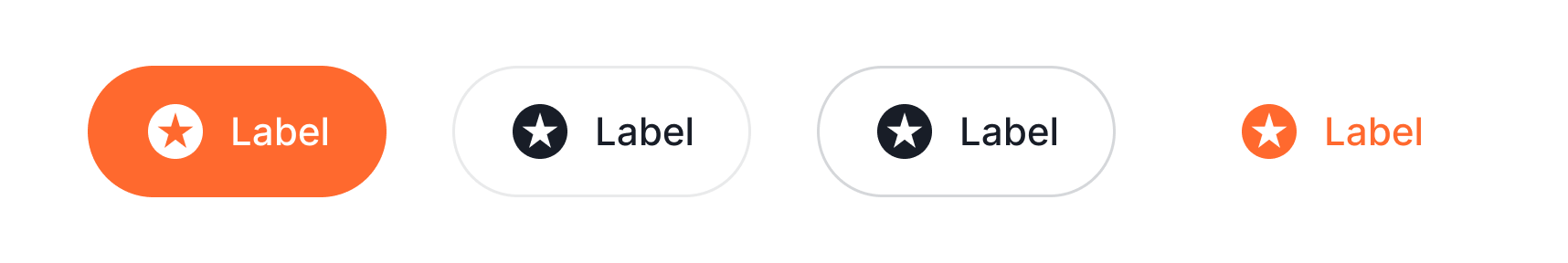
- Navigation
- Segmented


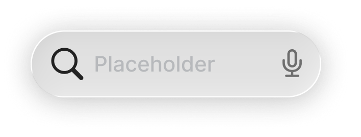
- Search

Context
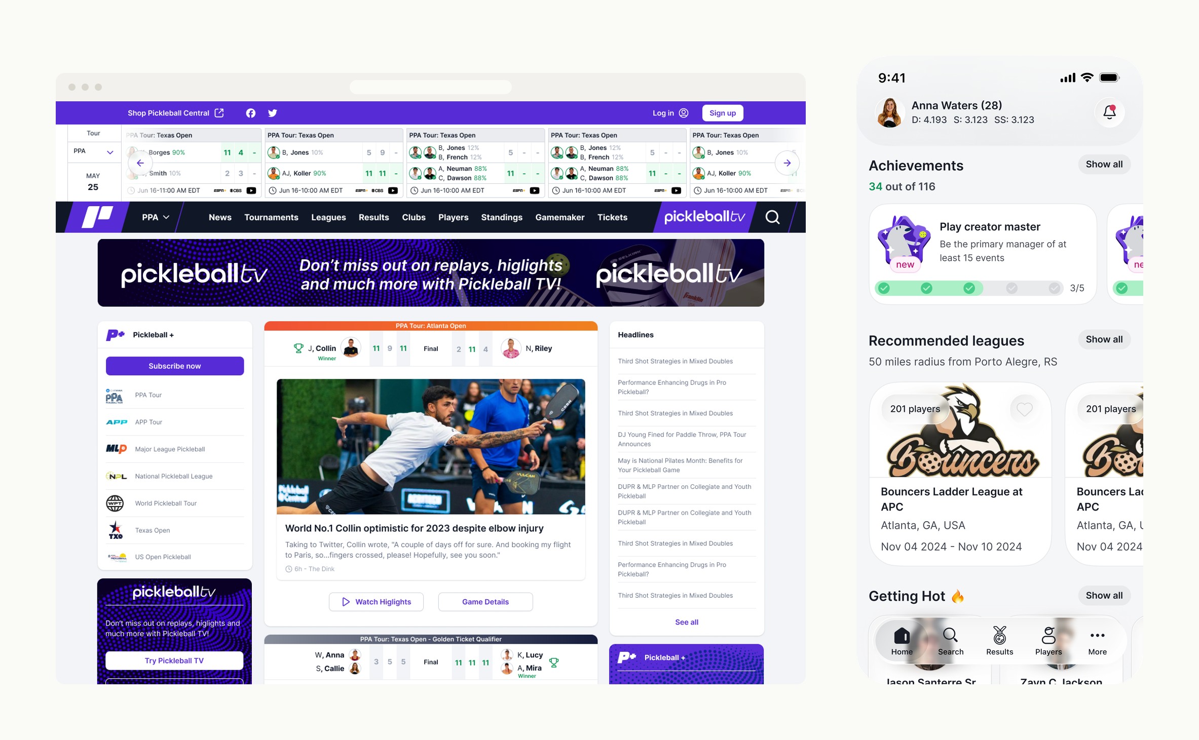
Pickleball.com launched in October 2022 as the central digital hub for the sport. The platform unifies six sub-products under one front door: tournaments, leagues, team leagues, clubs, brackets, and world rankings. Each sub-product carries its own brand identity and color signature. Each was built on its own timeline. Players, league organizers, and tournament directors all move between them, often the same person in the same week.


Problem
Six sub-products, no shared design language. Each surface (tournaments, team leagues, ladder leagues, admin manage flows) had its own conventions, its own components, its own logic. Users moving between them had to relearn the product each time. There was no source of truth, and nothing engineering could build against without rebuilding patterns from scratch. The roadmap made it worse: the platform was committing to multiple native apps over time, and a system that could not scale past one app would collapse the moment the second one started.
I pitched native-first as the way out. Build the system once, ship it on web as a unification layer, and structure it so new native apps inherit it instead of reinventing it. The constraint was strict: the system had to absorb the existing surfaces without halting feature work, hold up across web and two new native platforms, and theme cleanly per sub-product without forking the foundation.
Approach
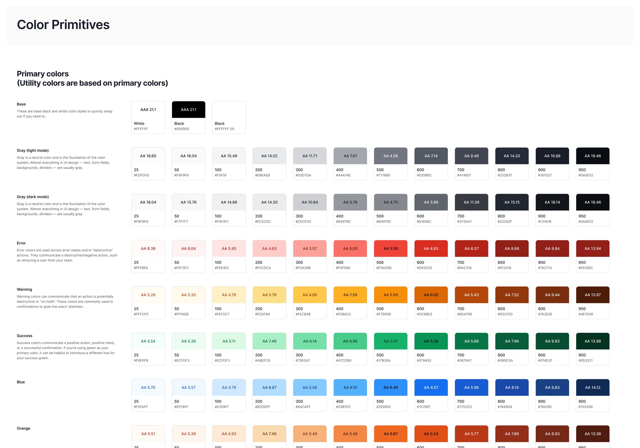
Build the system atomically, tokens first
I built atomically, tokens first. Color, type, spacing, motion as the foundation. Atoms (buttons, inputs, badges) above them. Molecules (form rows, stat strips, table cells, achievement progress) above those. Organisms (toolbars, league cards, score cards, ranking cards, match-detail sheets) on top. Every component carried its full state set from the start: default, hover, active, focused, disabled, loading, error.
The foundation starts with color. Every value is a step on a contrast-checked ramp, not a one-off hex, and the brand layer themes those tokens per sub-product without forking them.
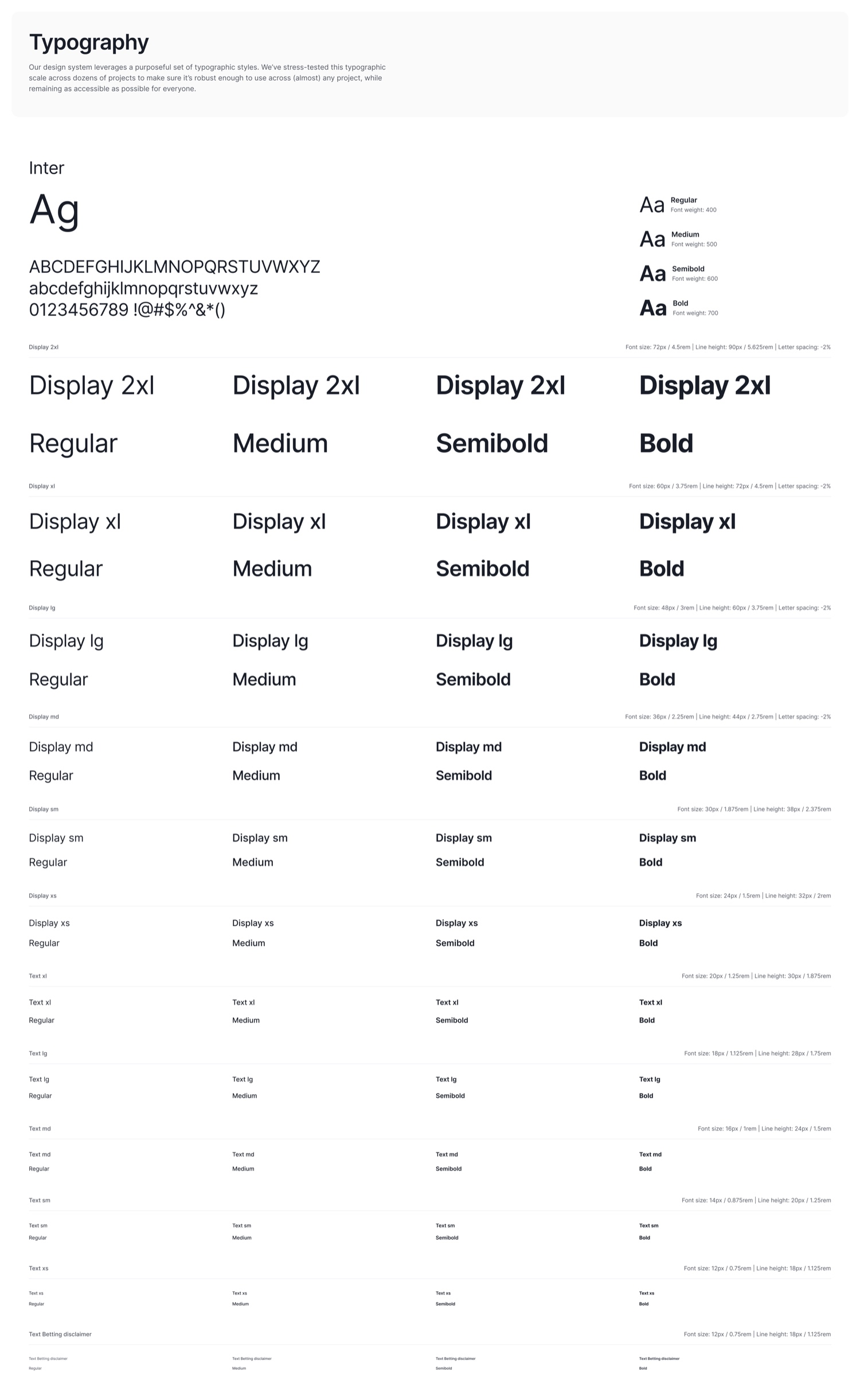
Type is part of that foundation, not a later decision. The scale is fixed once, and every surface composes from it rather than re-deciding it.
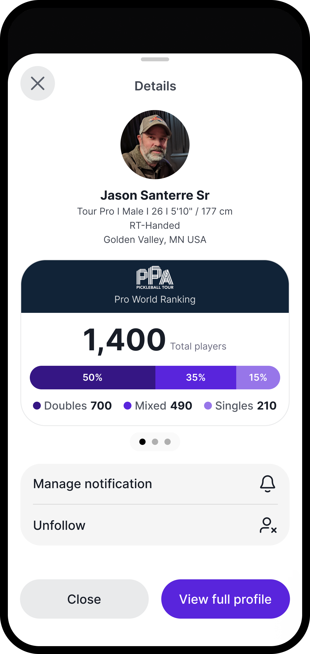
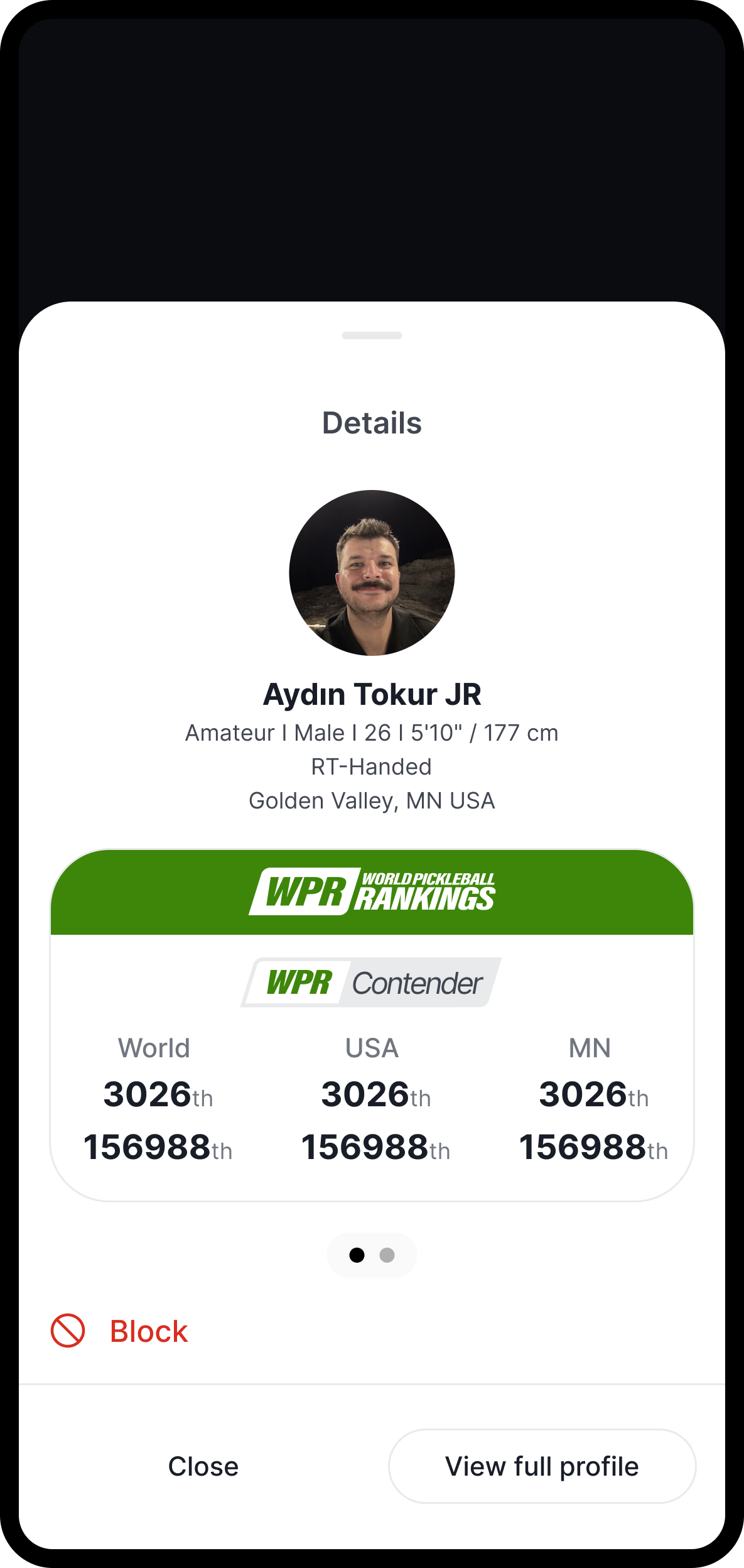
The system absorbed real product complexity in one component family. The ranking card themes per ranking organization (WPR green, DUPR navy, PPA Pro Tour navy with its own mark), flexes across states (overall rank and points with a recent-form chart, per-discipline point totals, a player-distribution breakdown), and conditionally renders by user type: a verified Pro sees the PPA Pro World Ranking, an amateur sees WPR. The same card is themed natively on each platform, iOS and Material 3. Several layers of variability inside one component, manageable because the tokens, layout grid, and stat-row pattern underneath are shared.
The same approach handled cross-product theming. The native navigation bar supports six brand color signatures, one per sub-product, with the home icon swapping based on which product the user is in. One component, six themed variants, zero forks. Engineering ships once, every sub-product looks like itself.
Most design systems start at the component level and retrofit tokens later. That always breaks at the first theme change or accessibility audit. Starting with tokens meant the system could absorb new surfaces, new ranking integrations, and new conditional rules without re-deciding what “primary” meant. It also gave engineering a single place to apply contrast and spacing rules at scale.
-
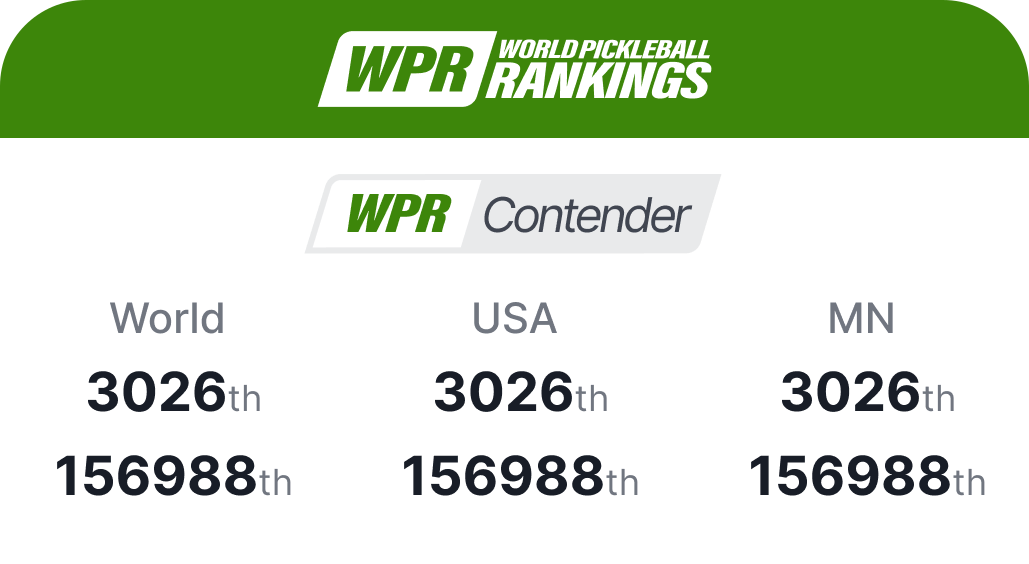 WPR · World Pickleball Rankings
 -
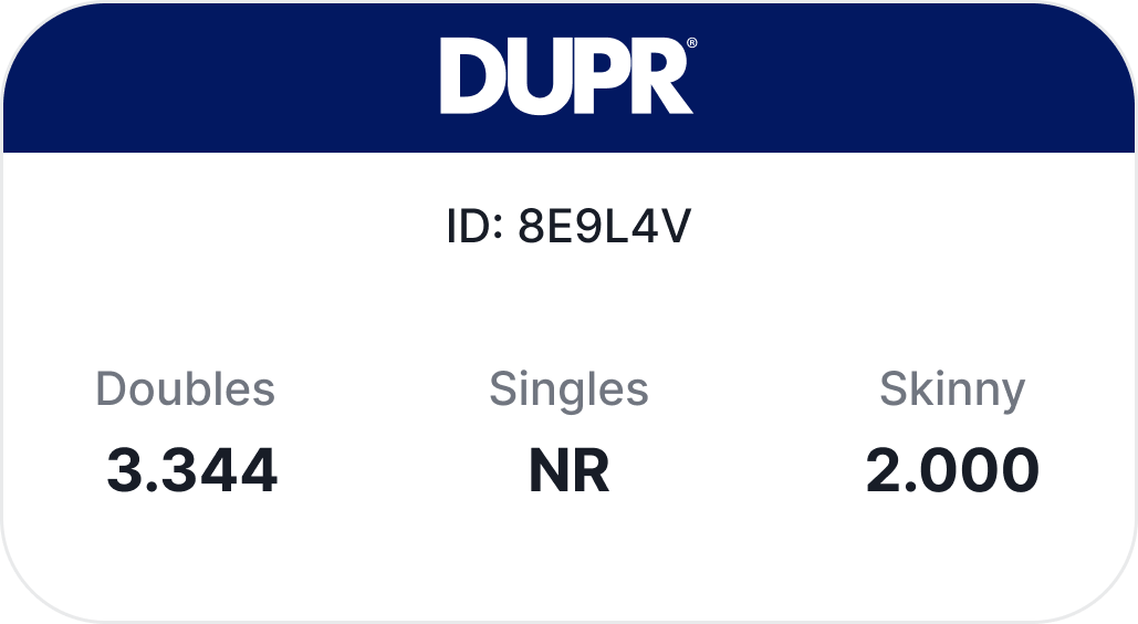 DUPR
DUPR -
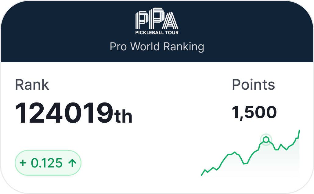 PPA · rank, points, form
 -
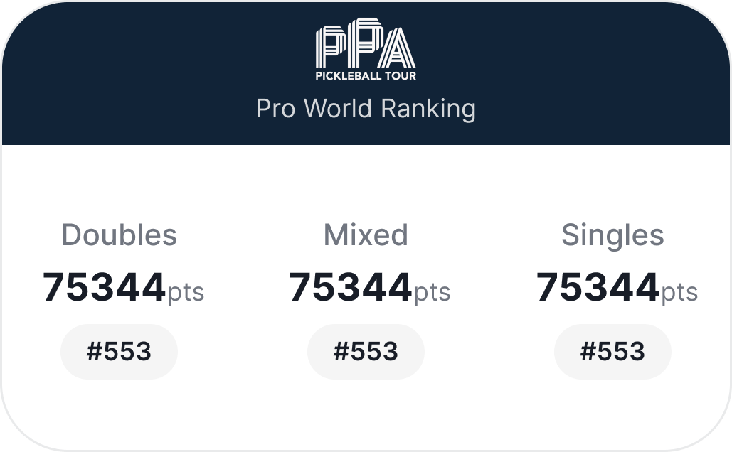 PPA · per discipline
Harmonize one primitive library across iOS and Material 3
The foundational native decision was to not invent a cross-platform UI language. iOS uses Apple’s Human Interface Guidelines as its structural grammar; Android uses Google’s Material 3. The system imports both source kits and re-themes them once: iOS 26 Liquid Glass buttons, the native tab bar, bottom sheets, system type and gestures on one side; M3’s filled / tonal / outline / text hierarchy, M3 navigation, native search on the other. Brand lives in color, motion, and component personality. Structure stays native.
This is what makes the primitive library a system asset rather than a per-app cost. The same component identity, a button, a tab bar, a segmented control, a search field, exists in both native languages, themed from the same tokens. A native iOS button that looks like a Pickleball button still behaves like an iOS button. An M3 tonal button that uses the accent still scales focus and ripple the way Android expects. The system inherits a decade of platform-learned behavior instead of paying to reinvent it, and it inherits it once, centrally, for every downstream app.
-
Buttons
-
Bottom navigation
-
Segmented control
-
Search
Structure the system in three tiers so it scales to new apps
The platform’s roadmap is to ship multiple native apps over time, not one. A single monolithic Figma file would collapse under that weight. So I structured the system in three tiers, each with its own file.
Tier one is the native primitive library. Apple’s iOS Human Interface Guidelines source kit and Google’s Material 3 source kit, imported from each company’s libraries and re-themed for Pickleball. Buttons (including iOS 26 Liquid Glass), tags, contextual menus, navigation, segmented controls, pagination, search and toolbar, app bar, bottom sheet, alerts, lists and tables, action sheets, date pickers, sliders, text fields, toggles, tabs, chips, snack bars. Every native primitive a downstream app could need, themed once.
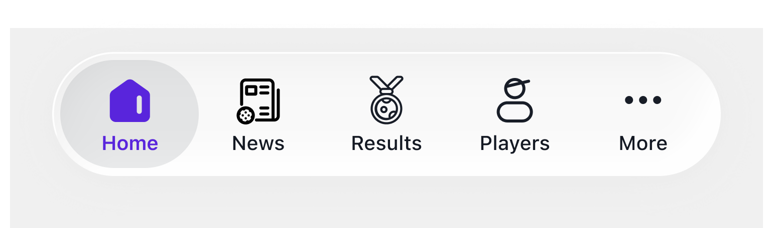
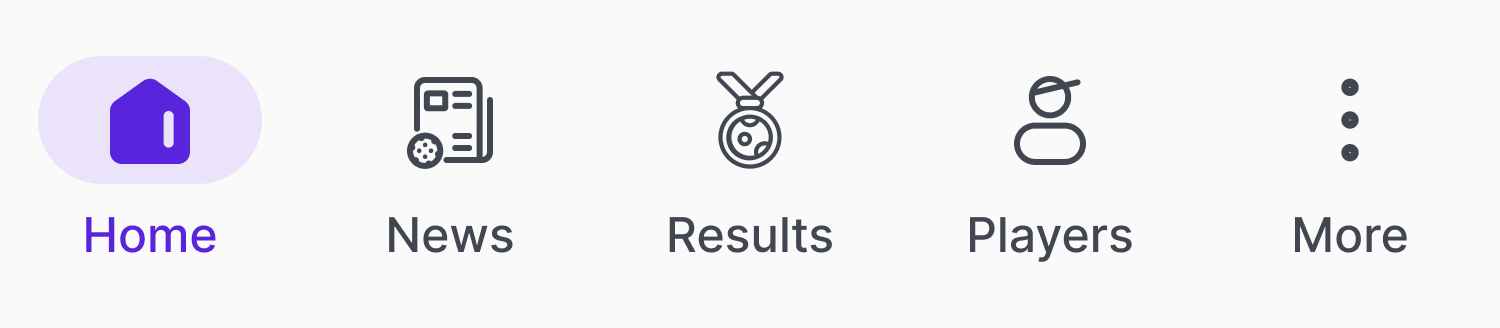
Tier two is shared screens and global components. A global bottom navigation system, a global top bar, score cards, ranking cards, achievement cards, Getting Hot cards, news cards, invitation cards, notifications, onboarding and login flow, player search, settings, error and empty states. These live in their own file and are referenced by every native app. New app stands up, new app inherits these for free.
Tier three is the app-specific file. Each native app (Ladder Leagues, the Pickleball.com mobile app, the upcoming Tournaments app) gets its own file that composes shared screens with its own homescreen, detail flows, schedule, and admin or manager pages.
The payoff: new apps stand up in weeks, not quarters. The native primitive layer updates once per OS revision (when Apple ships iOS 27, when Google ships M4 patterns) and propagates downstream automatically. App teams stop arguing about button shape and focus on what’s actually different about their product.
- Tier 1
Native primitives
Apple's iOS Human Interface Guidelines and Google's Material 3 source kits, imported and re-themed once for the entire system.
- Buttons (Liquid Glass + M3)
- Bottom sheets
- Tabs
- Lists & tables
- Search bars
- Toggles
- Chips
- Date pickers
- Action sheets
- Alerts
- Text fields
- Snack bars
- Tier 2
Shared screens and global components
Referenced by every native app, themed by the brand layer below. New apps inherit these for free.
- Global bottom nav
- Global top bar
- Score cards
- Ranking cards
- Achievement cards
- Getting Hot cards
- Onboarding
- Player search
- Notifications
- Settings
- Tier 3
App-specific compositions
Each native app composes shared screens with its own homescreen, detail flows, and admin or manager pages.
- Ladder Leagues app
- Pickleball.com app
- Tournaments app (in dev)
- Future apps
One front door, six sub-products
A system is only real once it composes into the product. On web, the six sub-products sit behind one navigation, one type and color foundation, and one component set, themed per sub-product rather than forked. The unification the platform was built to deliver is the thing a visitor actually lands on.
Outcome
By the end of the year the system was powering six web sub-products and the platform’s native apps (Ladder Leagues and the Pickleball.com app, on iOS and Android), with the next ones scaffolded in development. It composes one platform at real scale.
0+
Monthly active users on the platform the system powers
- 40%
- Faster design-to-development handoff
- 6
- Sub-products unified on one system
- 0
- Forks of the token foundation
System adoption across product teams was high, and engineering ship velocity improved measurably once teams started composing from the shared component library instead of rebuilding patterns per surface. Qualitative feedback from league organizers and tournament directors flagged the consistency of flows across surfaces as a noticeable improvement, often surfaced in onboarding sessions before being asked.
How that system became two shipped native apps, and where mobile pulled the roadmap forward, is its own story: Shipping native on iOS and Material 3.
Reflection
What surprised me: cross-platform parity turned out to be an accessibility problem in disguise. Web and native share the same logic and intent, but accessibility forces different paths to the same action. The same task that takes one keyboard combo on web might require a different gesture, timing, or focus order on iOS to be reachable for assistive tech. Designing accessibility into the token and component layer, as the bridge between platforms rather than a polish pass at the end, is what kept the surfaces feeling like one product instead of three coincidentally similar ones.
A real tension I navigated: the constant pull to fork the foundation per sub-product. Six brand signatures and three ranking integrations each made a reasonable case for “just this once.” Holding the line, one token foundation, themed variants instead of forks, was the single decision the system’s longevity depended on, and the one that needed defending most often.