Senior Product Designer, Pickleball.com, Jan 2025 to present
Shipping native on iOS and Material 3
Two native apps shipped on iOS and Android, built on a shared three-tier system. A strict web-parity floor with bespoke mobile micro-flows on top, and mobile-first analytics strong enough that stakeholders pulled them onto the desktop roadmap. 75,000+ monthly active users.
- Role
- Senior Product Designer
- Timeline
- Jan 2025 to present
- Outcome
- 75k+ monthly active users
Context
Pickleball.com unifies six sub-products under one front door: tournaments, leagues, team leagues, clubs, brackets, and world rankings. The hard part of making it one product was a shared design system, built native-first as three tiers so it could scale to new apps without forking. That system, and why it was built that way, is its own case study: A three-tier design system for a multi-app platform.
This is the other half: with the system in place, the job was shipping it as real native apps that competitive players would actually live in between matches.
Problem
The platform had no native mobile app. For a sport whose players check rankings, results, and invites on their phones between games, that was a real gap, not a nice-to-have. A web view in a wrapper would have shipped fastest and felt worst.
The harder problem was discipline. A native app earns trust by feeling native and by never being a lesser version of the web product. So the bar was two things at once: hold a strict parity floor (everything the web does, the app does), and still feel like an app a competitive player reaches for, not a website they tolerate on a small screen.
Approach
Native, not a port
The early call was to not port the web design system one to one. iOS got the native tab bar, bottom sheets, system fonts, native gestures, and iOS 26 Liquid Glass. Android got Material 3’s button hierarchy, navigation patterns, and native search. Brand stayed in color, motion, and component personality. Structure stayed native, because native users have a decade of learned behavior and the cheapest reliability available is to inherit it rather than reinvent it.
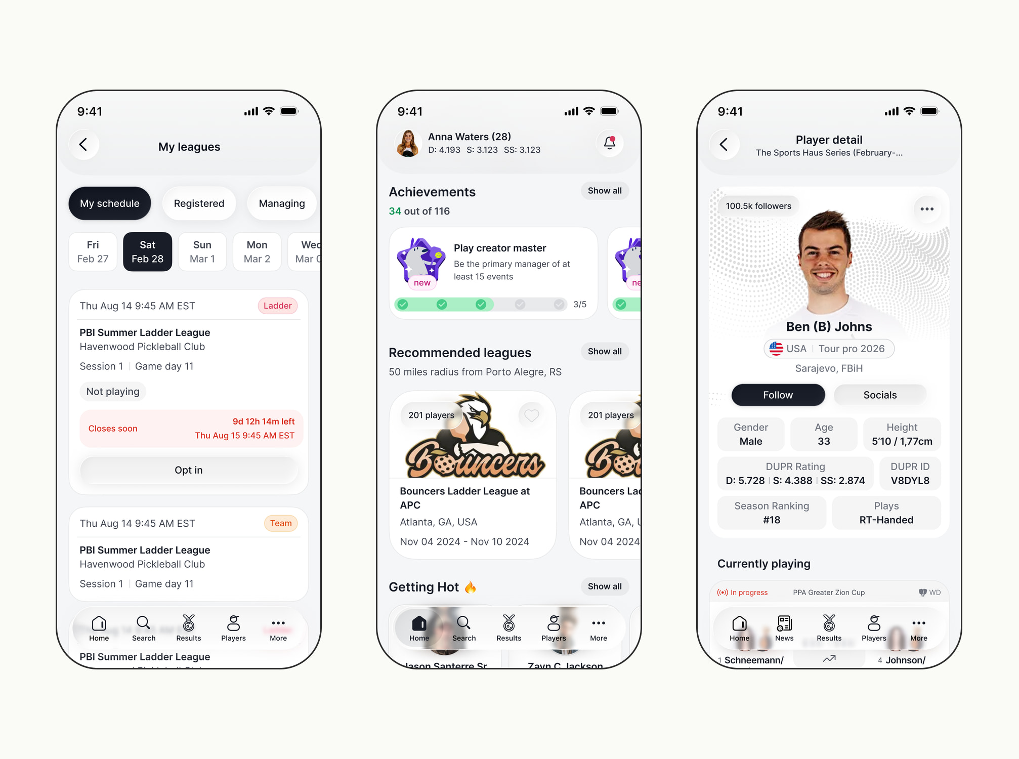
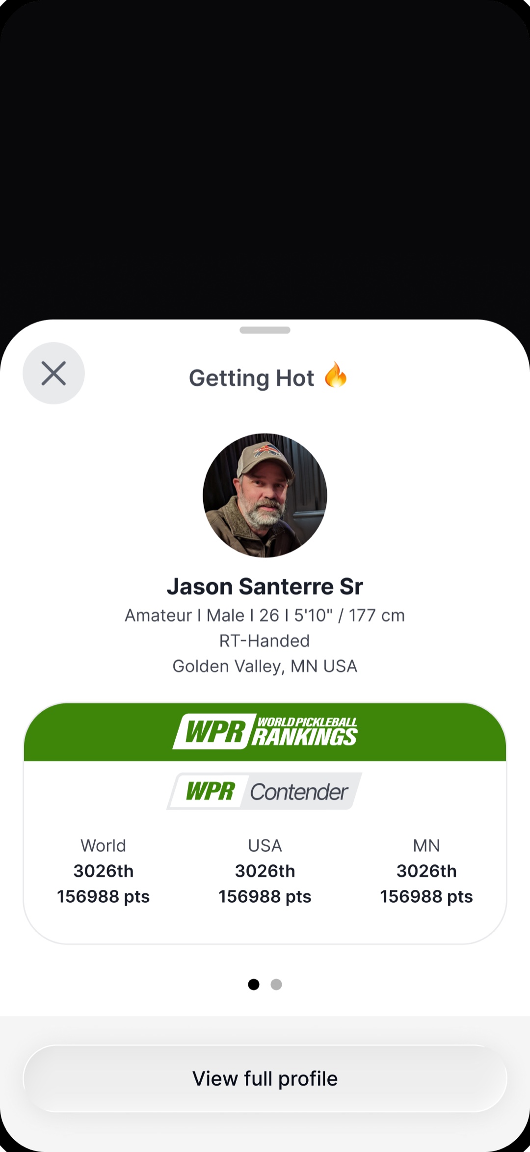
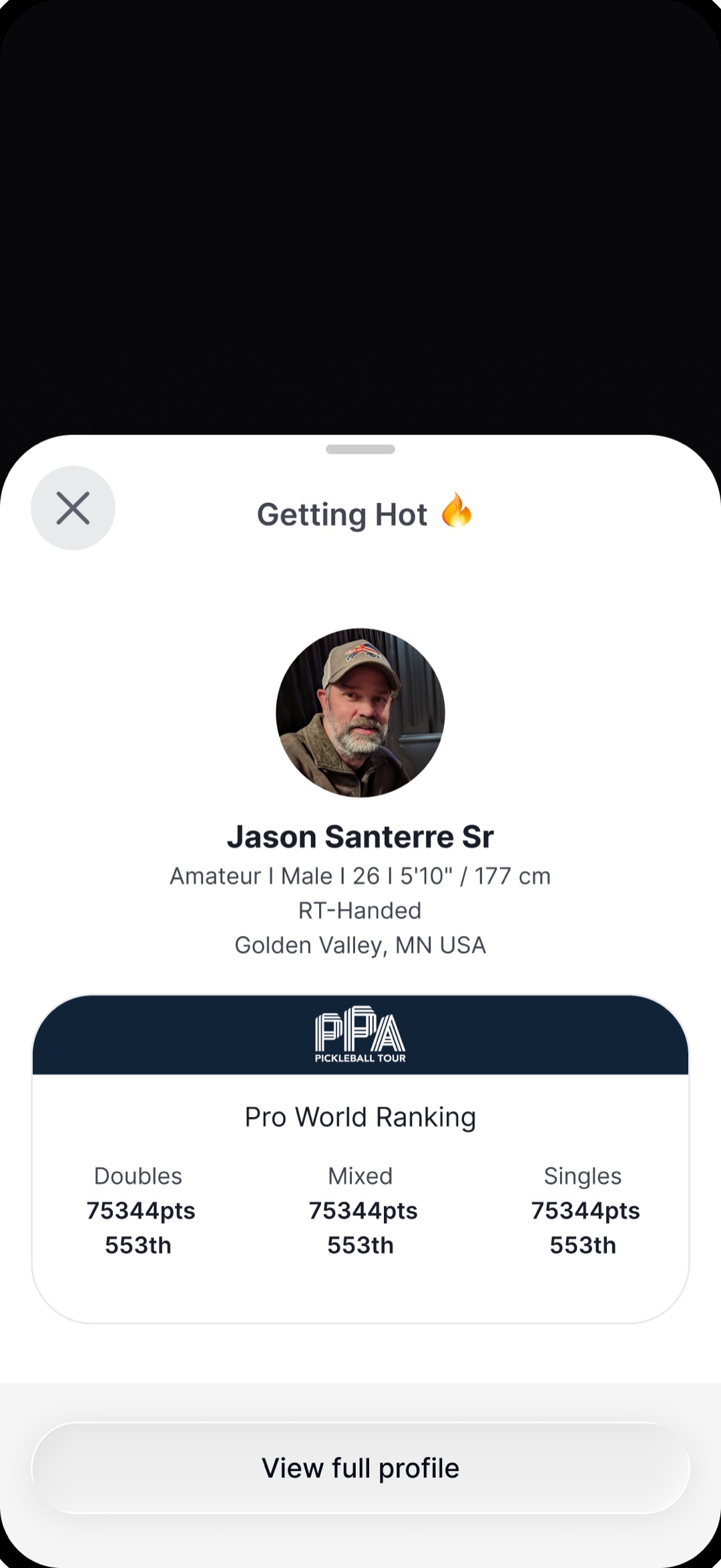
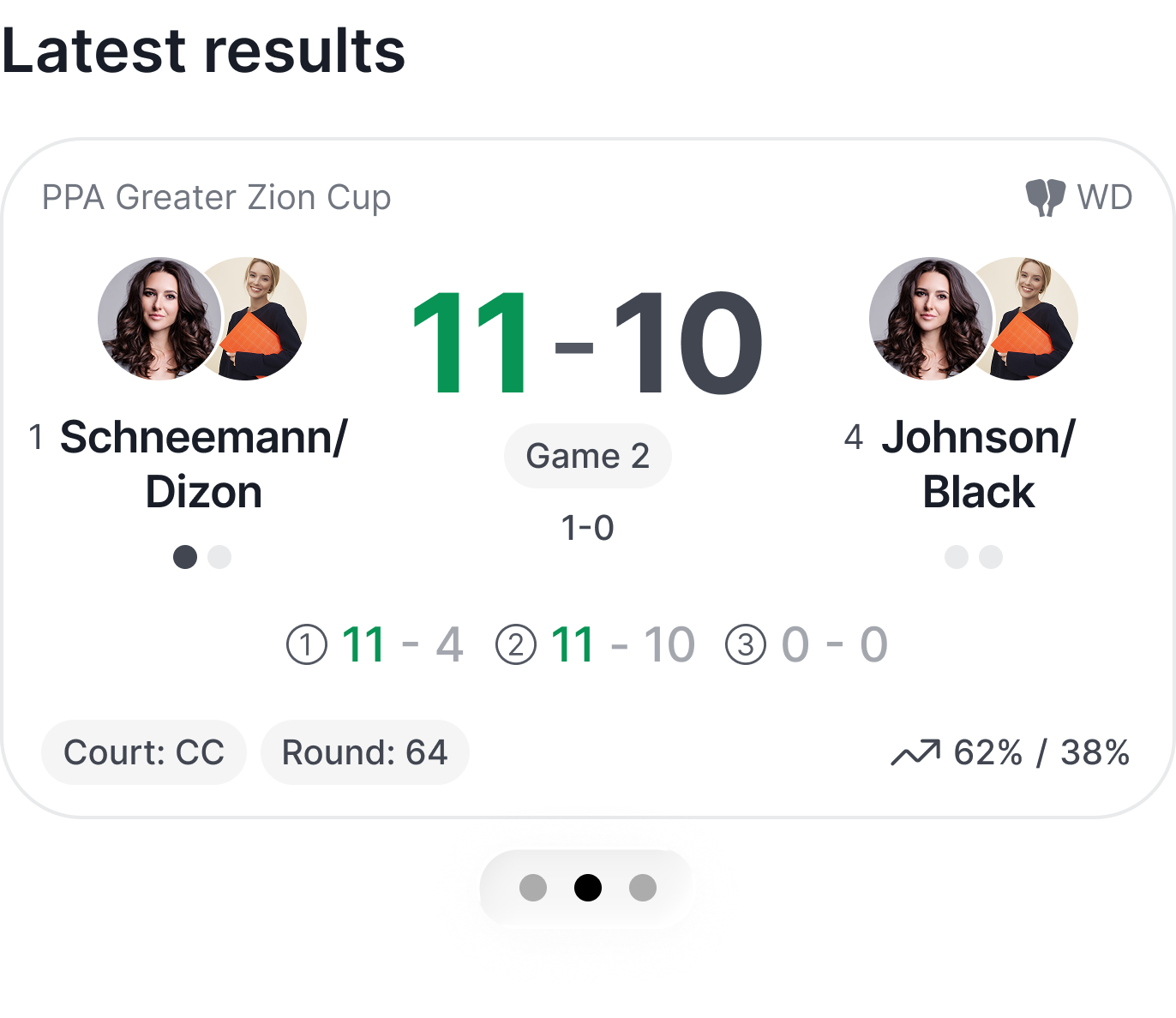
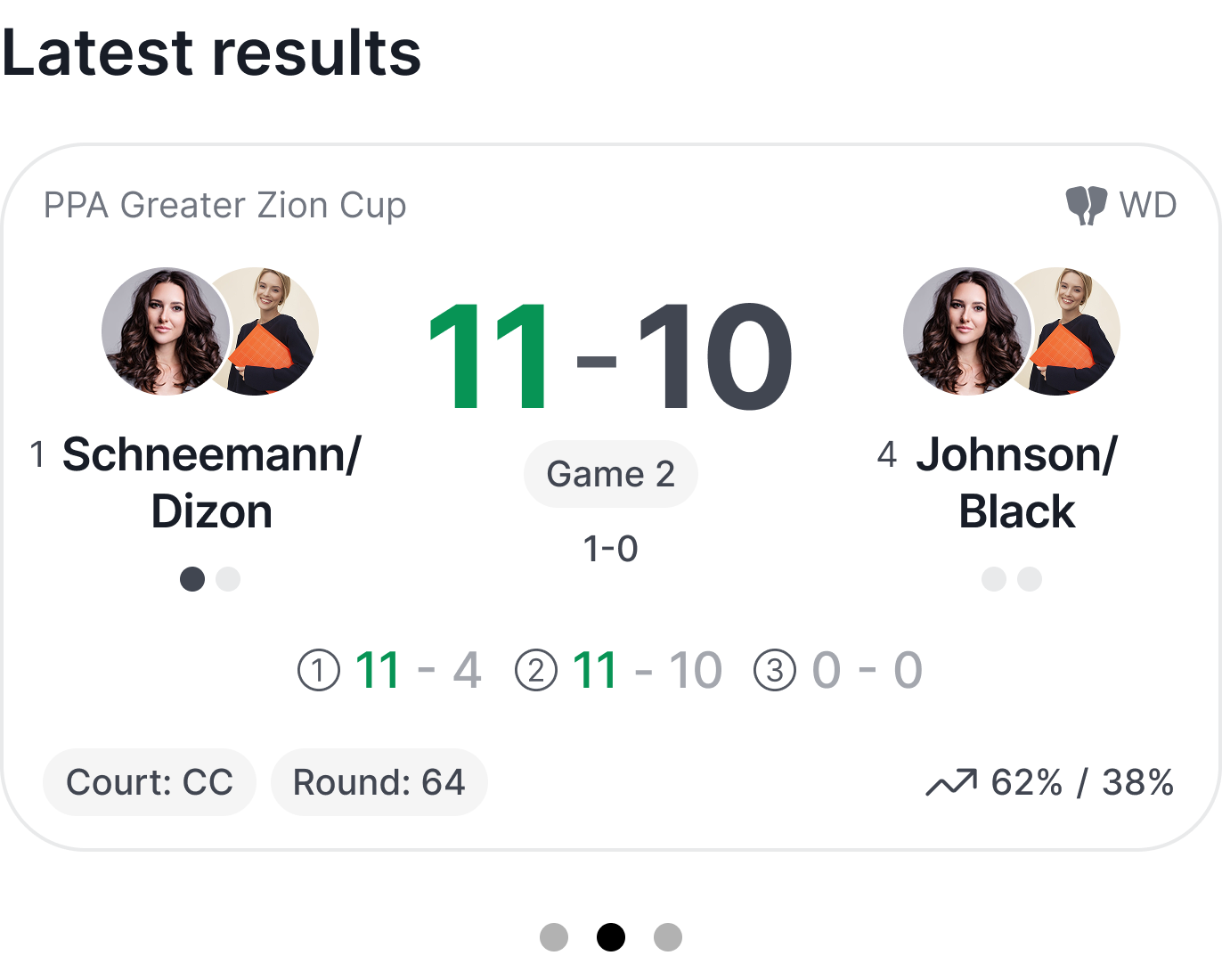
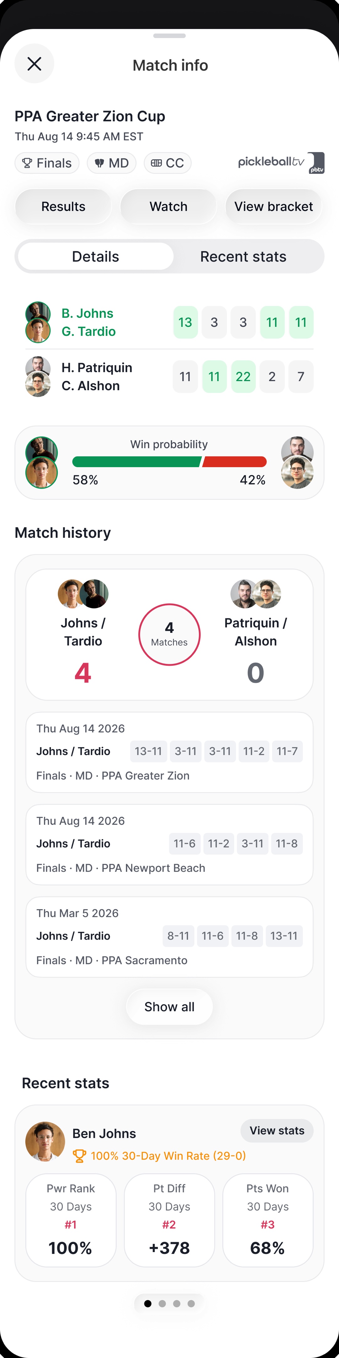
Bottom sheets earned their primacy as the primary detail-view pattern. Tapping a player’s card in Getting Hot opens a small sheet with their rank, the three ranking systems, and a “View full profile” escape hatch. Tapping a score card in Latest results opens a nearly full-height sheet with match details: players, win probability, match history, and recent stats, scrollable across additional matches without leaving context. The pattern preserves the home view behind every detail interaction. One swipe down returns you exactly where you were. Players don’t lose the rankings list to read about one player, and they don’t lose the results feed to read one match.
The same sheet handles an amateur and a pro without changing pattern: it just carries the ranking system that player lives in.
Parity floor, mobile-native upgrades on top
Every action available on the web is available on iOS, no exceptions. Where mobile context made things faster, the iOS version got bespoke micro-flows instead of a shrunken web layout.
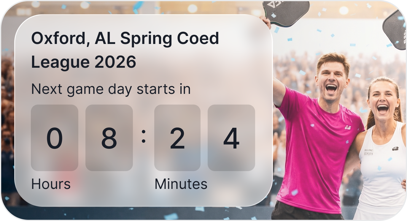
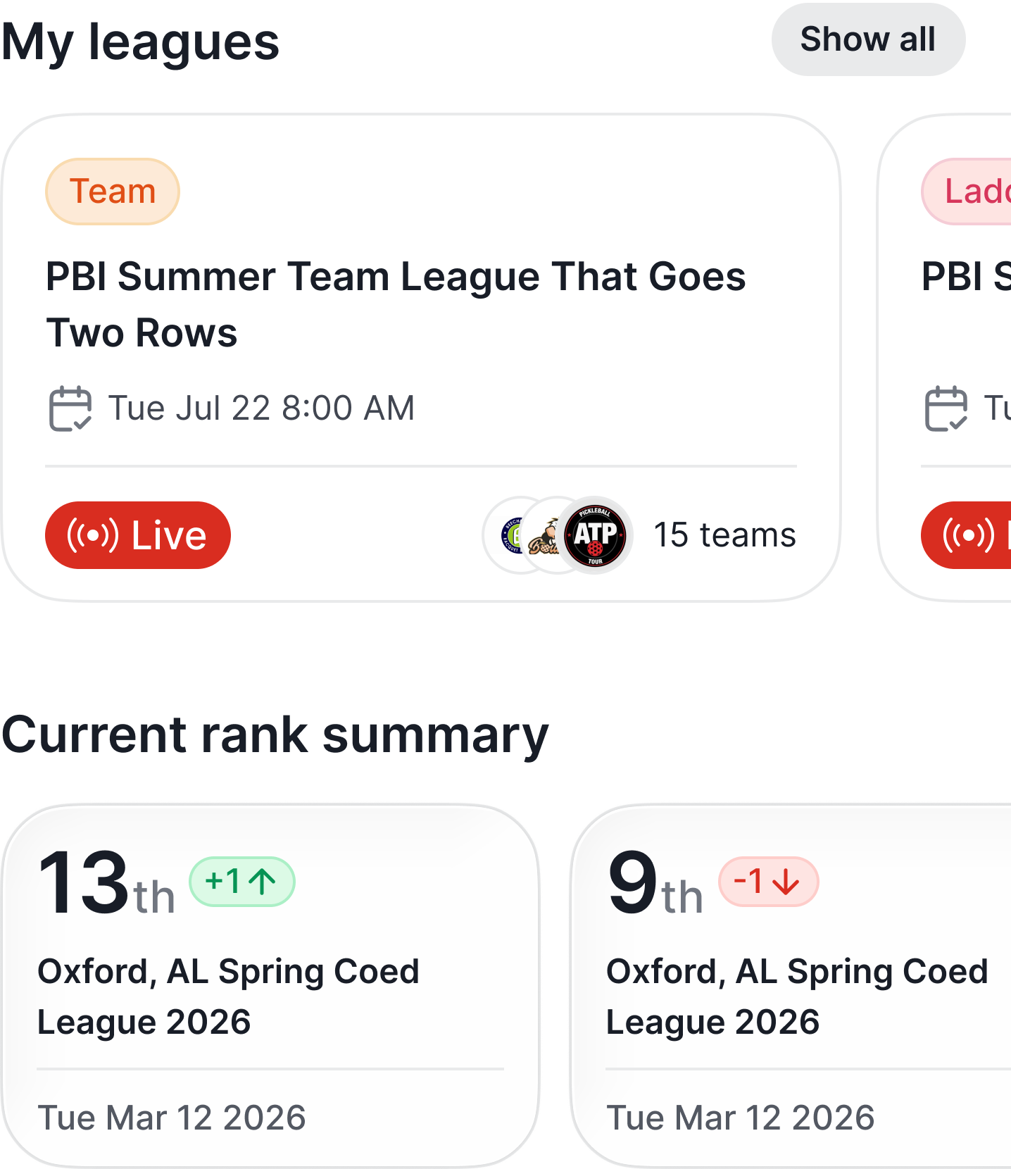
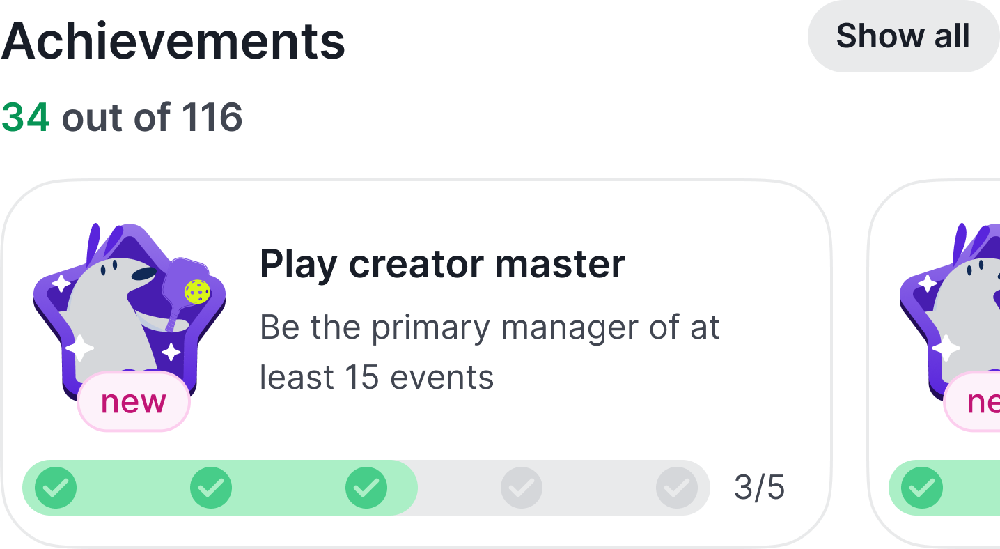
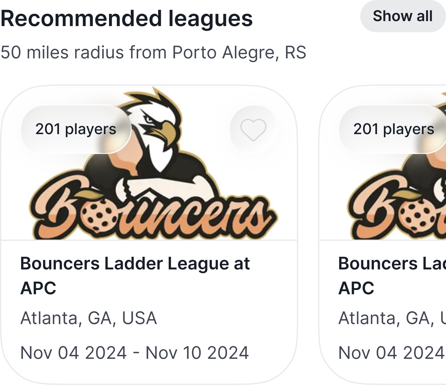
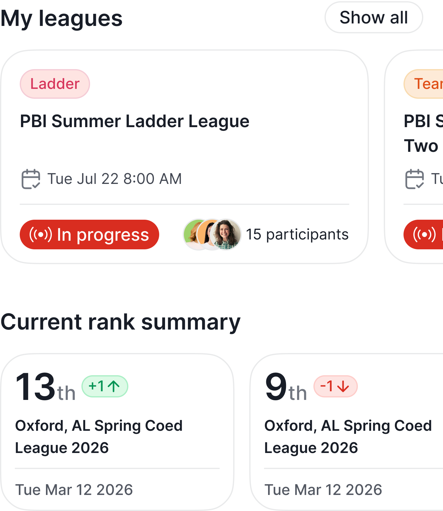
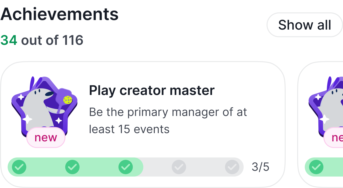
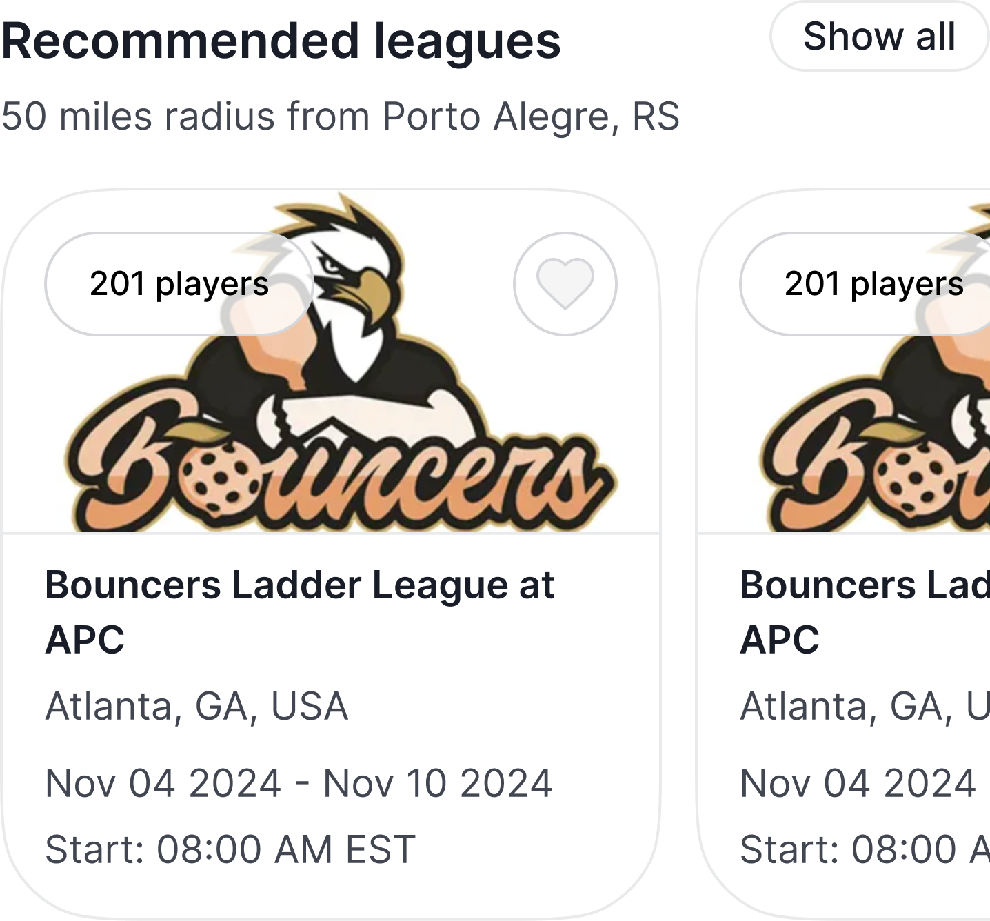
The homepage hierarchy is the clearest example. A returning player’s mobile home reads, top to bottom: pending invites (active obligations), create or find a league (action shortcuts), my leagues (identity), current rank summary, latest results, achievements (growth), recommended leagues, getting hot (social discovery). The web equivalent leans marketing and stats. On mobile, the shelf order is intentional: active actions, then identity, then growth, then discovery. A player opening the app sees what they need to act on before what they could explore.
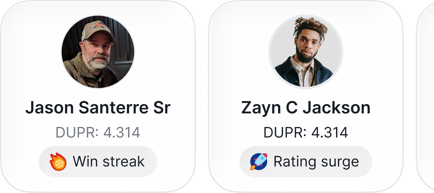
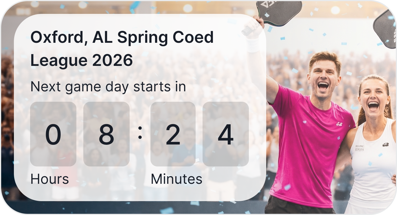
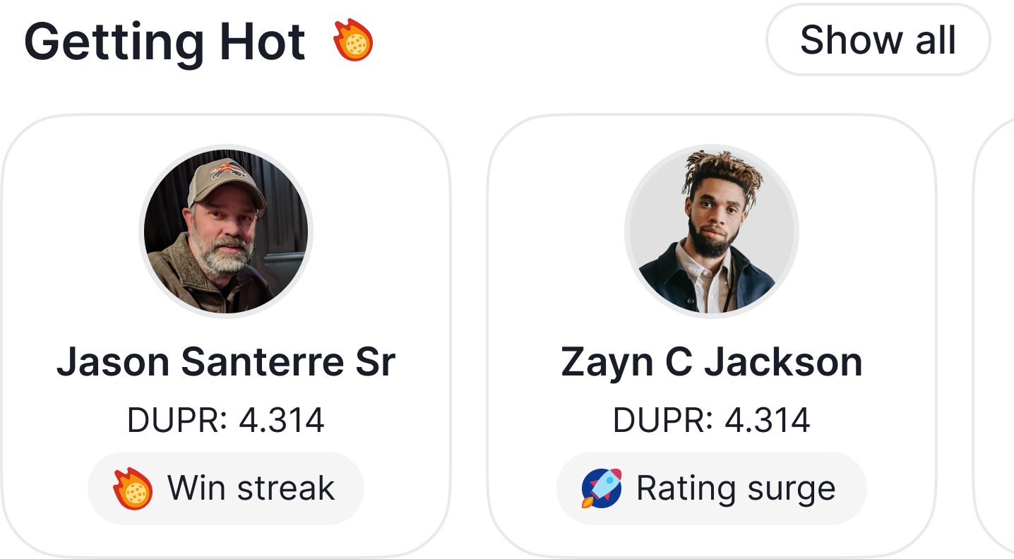
Smaller details land too. The pending invites card carries a live countdown that animates as the hour ticks down. Recommended leagues are geo-aware (50-mile radius from the player’s saved location). Getting Hot is curated discovery, surfacing players on win streaks or rating surges with a single-tap entry into a player sheet. None of these are revolutionary alone. Together they make the app feel like a competitive-grade companion, not a smaller version of the website.


Scroll the page, scroll the app. The status bar and tab bar stay docked. The content underneath moves the way it would in a player’s hand.
Top to bottom: pending invites first (active obligations), then my leagues, current rank summary, latest results, achievements, and recommended leagues. Active actions, then identity, then growth, then discovery. The web equivalent leans marketing and stats. On mobile, the order is what a returning player needs to act on before what they could explore.
Mobile-first analytics that moved the roadmap
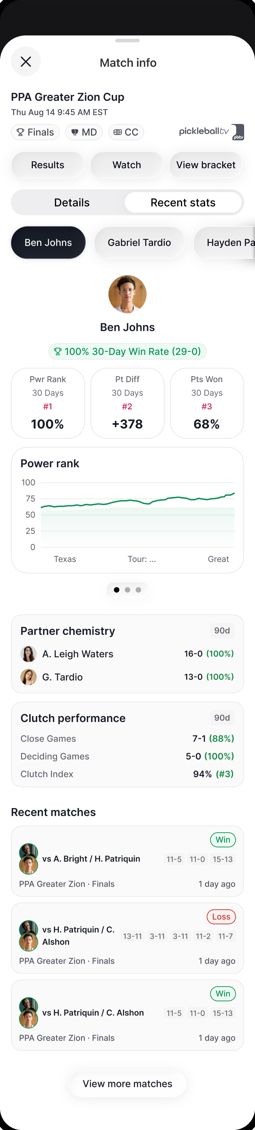
The match details sheet is where the native bet paid off hardest. On web, the recent-stats column was thin. On iOS and Android, opening a match reveals win probability, full match history with set-by-set scores, partner chemistry (win rates with specific partners), clutch performance (close-game and deciding-game win rates), and a Power Rank line chart trending the player’s recent form.
These analytics shipped as mobile-first additions, not ports of existing web features. The data already lived in the platform; the decision was to surface it in the moments between matches, on the device in a player’s hand. Once stakeholders saw the mobile depth, they asked for the same on web. That work moved onto the roadmap. The mobile design pulled the desktop scope forward, not the other way around, which is the strongest argument for native-first I can make.
This is the screen that did it. Open a match from Latest results and the sheet carries the whole picture: win probability, set-by-set history, head-to-head, then a second tab of recent form.
Outcome
Two native apps shipped on iOS and Android (Ladder Leagues and the Pickleball.com app), composed entirely from the shared system, with the next ones in development.
0+
Monthly active users across the platform
- 2
- Native apps shipped, iOS and Android
- 100%
- Web-parity floor held, zero feature gaps
- 3
- Mobile-first analytics pulled onto the web roadmap
The apps held the parity floor and still felt native, and the mobile-first analytics (Power Rank, Partner Chemistry, Clutch Performance) were strong enough that stakeholders asked for the same depth on desktop, pulling work onto the web roadmap that had not been planned.
Reflection
What I’d do differently: more user testing, earlier and more often. The apps shipped and they worked, but next time I’d push to set up a real testing cadence before the team agrees it’s needed, not after. The corrections that come out of real-user sessions are usually small and specific, the kind internal review never catches.
A real tension I navigated: leadership wanted to ship without a demo period or a real testing window. We pushed for a compressed but real testing pass anyway. The feedback that came out of it was the part of the launch I’m most certain about, exactly the kind of small, specific corrections that internal review never surfaces.